
-
![]()
New List Item
Description goes here -
![]()
New List Item
Description goes here -
![]()
New List Item
Description goes here -
![]()
New List Item
Description goes here -
![]()
New List Item
Description goes here -
![]()
New List Item
Description goes here -
![]()
New List Item
Description goes here -
![]()
New List Item
Description goes here -
![]()
New List Item
Description goes here
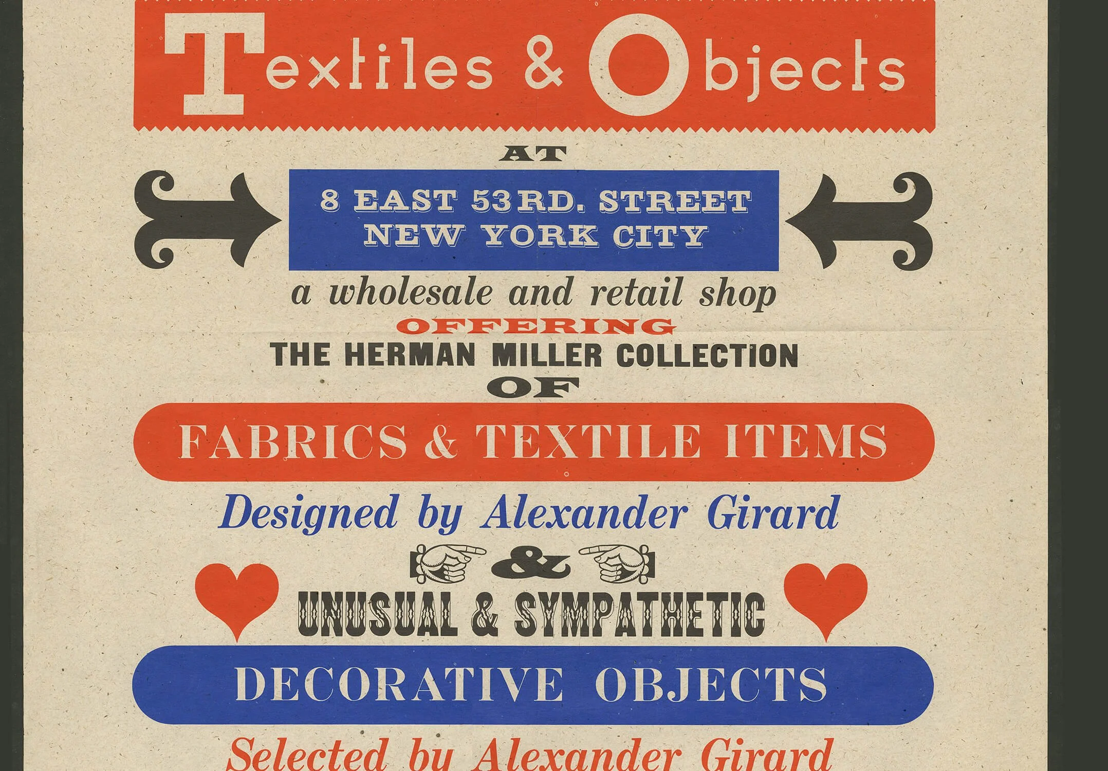
recent acquisitions
![Furniture Forum Spring 1957 [Handbook of Contemporary Design, Vol. 8, No. 1]. Sarasota, FL: Phillip L. Pritchard [Editor], Edgar Bartolucci [Art Director].](https://images.squarespace-cdn.com/content/v1/6a074f91e54cbe1a0e669fb9/6b8f87f8-b780-4818-8f77-b7a0feaff18f/furniture_forum_1957_spring_thumb.jpg)
Furniture Forum Spring 1957
Handbook of Contemporary Design
Volume 8, Number 1
Phillip L. Pritchard [Editor],
Edgar Bartolucci [Art Director]
Sarasota, FL: Phillip L. Pritchard, Spring 1957 [Volume 8, Number 1]. Quarto. Printed pebbled yapped wrappers bound with brads [as issued]. 44 pp. Fully illustrated in black and white. Curatorial information includes designer, materials, and measurements. Uncoated wrappers worn and soiled, but a very good copy.
8.75 x 11 softcover edition with 44 pages of black and white photographs of contemporary furniture, lighting, and fabric, circa 1957. This volume is a goldmine of reference material for identifying early-fifties contemporary furniture and home fixtures, but you probably already knew that, didn't you?
Contents:
Publisher’s Notes
Personalities: short illustrated profiles of Folke Ohlsson; Robert Alan Martin; Clifton Cook; Donald K. Soderlund; John R. Denst; Clarence Hawking; and Ted Ramsay.
Furniture: Baker Furniture: Finn Juhl; The Widdicomb Furniture Company: T. H. Robgjohn-Gibbings; Dunbar Furniture Corpration of Indiana: Edward Wormley; Janey Rosenblum Inc.; Dux Incorporated: Arne Jacobsen; Design International; Edgewood Furniture Company, Inc.: William Armbruster; Mills – Denmark: Emil Knudsen, Robert Alan Martin, James E. Mills (from the Arkitekt Collection); Zacho: Hans J. Wegner; Arch Gordon Company Inc.: Milo Baughman; Frederick Lunning, Inc.: Hans J. Wegner, J. Andersen; Westcort Company: Warren L. Doering; George Tanier: Verner Panton; Ficks Reed Company: John B. Wisner gets funky with the Mindoro Group; Robert Barber, Inc.: Paul Buehler Associates Manufacturing; Altamira: Ignazio Gardella, Zoncada, Marco Zanuso, Giuseppe Pagani; The Orsenigo Company, Inc: Walter Dorwin Teague; Lee L. Woodard Sons: selections from the Sculptura Group; B. L. Marble Chair Company; The troy Sunshade Company; Lehigh Furniture Corporation: Gerald Luss; Berge-Norman, Inc.; Willow & Reed, Inc.
Lighting: Nessen Studio, Inc.: Beverley Pick; The Liteline Corporation: Wilhelm Wagenfeld, A. F. Gangkofner.
Fabrics – Wallcoverings: Ben Rose; Angelo Testa & Company; W. B. Quaintance Company; Denst & Sonderland, Inc.: Ted Ramsay, John R. Denst, Donald K. Soderlund, Clarence Hawking; Greeff Fabrics, Inc.
Accessories: Architectural Pottery: La Gardo Tackett; Harris G. Strong.
The Furniture Forum Advisory Board for 1957 included Robert Alexander, Pietro Belluschi, Serge Chermayeff, Anne Franke, Paul Frankl, William M. Friedman, Alexander Girard, Charles Granger, Greta Grossman, Walter Gropius, Victor Gruen, Patricia Harvey, Marion L. Heuer, Karl Kamrath, Carl Koch, Ernest Kump, Dorothy Liebes, George Nelson, Richard Neutra, and Hugh Stubbins.
![Industrial Design, May 1967. New York: Whitney Publications, Inc., Massimo Vignelli [Designer].](https://images.squarespace-cdn.com/content/v1/6a074f91e54cbe1a0e669fb9/dfd34872-64e2-4e5b-83a9-95adb3d9b129/industrial_design_1967_05_thumb.jpg)
Industrial Design
May 1967
James R. Mellow [Editor],
Massimo Vignelli [Designer]
New York: Whitney Publications, Inc., Volume 14, Number 4, May 1967. Side-stitched perfect bound wrappers. 88 pp. Illustrated articles and advertisements. Multiple paper stocks. Elaborate graphic design throughout. Magazine format and design by Massimo Vignelli premiered with this issue. Wrappers lightly worn and soiled, textblock lower corner bruised, but a very good or better copy.
9 x 12 magazine with 88 pages and illustrated throughout with an amazing variety of editorial content. The publishers wanted this magazine to accomplish: "A bi-monthly review of form and technique in designing for industry. Published for active industrial designers and the design executives throughout industry who are concerned with product design, development and marketing."
Here is former ID editor Ralph Caplan's recounting the magazines birth: "Fifty years ago, the publisher Charlie Whitney ran into Henry Dreyfuss. 'Henry,' he said, 'I'm about to publish a magazine for industrial designers.' 'Wonderful,' Henry replied. 'There are 14 of us.' Caplan remembered, "I.D. was not begun as a magazine for industrial designers, but as a magazine for anyone who had a stake in design and cared about it. This allowed a great deal of editorial latitude."
Contents
The furniture industry in transition: America (includes work by Alexander Girard for Herman Miller, Don Albinson for Knoll, George Nelson for Herman Miller, Neal Small, Founders Furniture, Inc., Milo Baughman for Thayer Coggin, and Paul McCobb)
The furniture industry in transition: Britain (includes work by Robin Day for Hille and Alan Turville and John Lewak for Hille)
Three from Finland: includes work by Alvar Aalto, Yrjo Kukkapuro, and Pirrko Stenros
Ponti programmed: Walker Art Center's exhibit devoted to Gio Ponti
Design and management 2: Westinghouse—includes work by Eliot Noyes and Ed Redings with Paul Rand
Materials guide: designing blow-molded containers
Materials guide: anodic coatings for aluminum
Can aerosols spray their troubles away?
Packaging round-up
Departments include News, Editorial, Design and engineering, Technical literature, Calendar, and Reader service card
The 1982 AIGA MEDAL citation: “Upon the occasion of the major retrospective of the Vignellis' work exhibited at Parsons in 1980, The New York Times critic Paul Goldberger characterized Massimo and Lella Vignelli as “total designers.” They and their office have indeed done it all: industrial and product design, graphic design, book design, magazine and newspaper design, packaging design, interior and exhibit design, furniture design. Massimo and Lella work together in two ways: he concentrates on what they call the “2D”; she handles the “3D”. He's the visionary: “I talk of feelings, possibilities, what a design could be.” She the realist: “I think of feasibility, planning, what a design can be.”
The Vignellis were both born and educated in the industrial, more-European north of Italy, he in Milan and she in Udine, 90 miles away. Massimo's passion was “2D”—graphic design; Lella's family tradition and training were “3D”—architecture. They met at an architects' convention and were married in 1957. Three years later, they opened their first “office of design and architecture” in Milan and designed for Pirelli, Rank Xerox, Olivetti and other design-conscious European firms. But their fascination with the United States, which took root during three years spent here after they were married, eventually grew strong enough to lure them away from Italy permanently. “There is diversity here, and energy, and possibility,” recalls Massimo, “and the need for design.” He cofounded Unimark in 1964, which ballooned and collapsed as the corporate identification boom of the late 1960s hyperventilated, then ran out of breath. In 1972, their present office was formed: Vignelli Associates for two-dimensional design, Vignelli Designs for furniture, objects, exhibitions and interiors.
Not only do the Vignellis design exceeding well, they also think about design. It is not enough that something—a chair, an exhibition, a book, a magazine—looks good and is well designed. The “why” and the “how,” the very process of design itself, must be equally evident and quite beyond the tyranny of individual taste.
“There are three investigations in design,” says Massimo. “The first is the search for structure. Its reward is discipline. The second is the search for specificity. This yields appropriateness. Finally, we search for fun, and we create ambiguity.”
Vignelli design, in both three dimensions and two, is highly architectural in character. Massimo's posters, publications and graphic designs seem to be built in stories, separated by the now-familiar, bold, horizontal rules. Basic geometry is respected. The investigative design process moves from the inside out: “The correct shape is the shape of the object's meaning.” The Vignelli commitment to the correctness of a design has taken their work beyond the mechanical exercise of devising a form best suited to a given function. They've always understood that design itself, in the abstract, could and should be an integral part of function. More than a process and a result, design—good design—is an imperative. “Everything has its own order,” they've said. “You can't take a piece of music and scramble the notes. You can't take a piece of writing and scramble the words. You can't take a space and scramble the chairs around.”
Both in the example set by their work and by their personal commitment of time and energy, design has no advocates more passionate or effective. Both teach, write, lecture, serve on juries and boards, contribute their talent and cast to worthy causes. Unabashedly urban and urbane, their participation in the world of design is enthusiastic, inquiring, generous. The Vignellis are true believers: “When we were young and naïve, we thought we could transform society by providing a better, more designed environment. Naturally, we found that this was not possible. Now, we think more realistically: we see a choice between good design and poor or nondesign. Every society gets the design it deserves. It is our duty to develop a professional attitude in raising the standard of design.”
That sounds serious, and the Vignellis are serious about design. But it is seriousness of purpose conveyed most often through exuberance. When either Massimo or Lella says the word “design,” it is pronounced with a capital “d”: “Design.” As individuals and professionals, their commitment to design and their accomplishments in design have rewarded them well. The Vignelli office continues to thrive and assignments come from an ever more diverse range of clients. Graduates of their firm have set out on their own and established well-respected practices. Only a few of the best and brightest are hired out of the schools each year. Their calendars are crammed; their pace formidable.
“The reward?” asks Massimo, paraphrasing the question. “Why, the reward is to do all this!”
In DESIGN LITERACY (Second Edition, Allworth Press), Steven Heller wrote an essay describing the historical significance of Industrial Design magazine: “Industrial Design was the brainchild of publisher Charles Whitney, who also published the successful Interiors. In 1953 he was convinced by his friend and advisor George Nelson that the time was right to introduce a specialized periodical devoted to practitioners of this burgeoning field. Interiors was already featuring its own industrial design column that had evolved into a discrete section, which Whitney realized had commercial potential as a spinoff. Interiors was also so beautifully designed that Industrial Design could have no less the visual panache of a coffee table book/magazine, replete with foldouts and slipsheets, not unlike the legendary design magazine Portfolio, published between 1949 and 1951. To accomplish this an eminent art director was sought. This was the age of great magazine art directors -- including Alexey Brodovitch, Alexander Liberman, Otto Storch, Cipe Pineles, and Alan Hurlburt -- and Whitney fervently believed that a magazine's design would be the deciding factor in its success. Hence Lustig was entrusted with considerable authority to design the magazine as he saw fit.”
“On the editorial side, however, Whitney decided to take a calculated risk by promoting two young Interiors associate editors to co-editors of Industrial Design. Jane Fisk (now Jane Thompson of the architectural firm Thompson & Wood in Cambridge) and Deborah Allen may have been inexperienced in the field of industrial design but nevertheless had a clear plan to introduce a distinctly journalistic sensibility into professional publishing that emphasized criticism and analysis rather than the puff pieces common to the genre. As it turned out, this became a point of philosophical contention between the designer and editors.”
“If they had a choice the editors would have preferred an art director who, as Thompson explained, "would have been in the trenches with us," a team player with journalistic instincts rather than a distant presence with a formalist sensibility. Because Lustig designed the initial dummy and subsequent two issues in his own studio and returned with the completed layouts to the editorial offices he had made certain assumptions about the presentation of content that were often inconsistent with the editors' vision. "We did not want the words to be gray space, we wanted them to have meaning," recalled Thompson about wanting more spontaneous design responses to the material. But instead of being journalistically intuitive, Lustig imposed his formal preconceptions, and designed the magazine as he would a book.”
“Blocks of text type were indeed used as gray matter to frame an abundance of precisely silhouetted photographs. But if there was a problem it was more in the editors' minds than Lustig's design. While it was not as journalistically paced as say, a Life magazine, it was respectfully, indeed elegantly neutral allowing, for a wide range of material to be presented without interference. Moreover, it was what Whitney wanted, so the editors reconciled themselves to building the magazine's editorial reputation through informative features written by authors not previously associated with trade publishing.”
“Thompson nevertheless hated the first cover with its tight grid and silhouetted photographs. Instead she wanted to disrupt the design purity with a few well composed coverlines. She further favored a conceptual method of intersecting photography, resulting in an editorial idea, not a pure design. Lustig thought coverlines would sully the design and intersecting ideas would be too contrived. Years later, Thompson grudgingly admitted that maybe Lustig's judgment was wiser: "He wanted to make a strong simple statement, which he believed (perhaps erroneously since Industrial Design did not have to compete on the newsstand) had to stand up against the covers of the elegant fashion magazines." Lustig's design set the standard for future covers, and his successor, Martin Rosensweig, continued to produce covers for a few years afterward that more rigidly adhered to the same formal practices.”
“Despite these creative tensions, the early issues of Industrial Design reveal a shift in the nature of professional publishing from a trade to cultural orientation that was in no small way underscored by Lustig's classically modern design.”
![Industrial Design 6, December 1956. New York: Whitney Publications, Inc., Jane Fisk Mitarachi [Editor].](https://images.squarespace-cdn.com/content/v1/6a074f91e54cbe1a0e669fb9/2563a3b6-1679-46bd-aeab-47f72d691eba/industrial_design_1956_06_thumb.jpg)
Industrial Design 6
December 1956
Jane Fisk Mitarachi [Editor]
New York: Whitney Publications, Inc., Volume 3, Number 6, December 1956. Original Edition. Side-stitched perfect bound wrappers. 144 pp. Illustrated articles and advertisements. Multiple paper stocks. Elaborate graphic design throughout. Wrappers rubbed with a small chip to spine crown, but a very good or better copy.
9 x 12 magazine with 144 pages and illustrated throughout and printed on different stocks, including an amazing variety of editorial content. Here is what the publishers wanted this magazine to accomplish: "A bi-monthly review of form and technique in designing for industry. Published for active industrial designers and the design executives throughout industry who are concerned with product design, development and marketing."
This issue of INDUSTRIAL DESIGN celebrated all the best of modern American industrial design. Includes many examples of furniture, ceramics, housewares, appliances, automobiles, buildings, radios, projectors, televisions, and many other objects designed for the burgeoning postwar middle class.
Contents include:
Annual Design Review: 102-page heavily illustrated feature presenting highlights of 1955 Industrial Design, including furniture, ceramics, housewares, appliances, automobiles, buildings, radios, projectors, televisions, toys and many other objects.
Introduction: What's New?
Communications
Appliances
Heating and Lighting
Obsolescence by George Nelson. With illustrated examples by Isamu Noguchi, Marcello Nizzoli, Gio Ponti, Paolo Venini, Ferdinand Porsche, Wilhelm Wagenfeld, Bruno Mathsson, Joseph Hoffmann, etc.
Design Classics from Abroad
Building
Equipment
Selling
The Annual Design Review includes work by Morton Goldsholl, Charles Eames, Raymond Loewy, Herbert Zeller, Eliot Noyes, Lippincott & Margulies, Henry Dreyfuss, Harold Van Doren, Nolan Rhoades, Mel Boldt, Yasha Heifetz, Ernst Lowy, Hary Lawenda, Max Weiss, Maurizio Tempestini, Jason Harvey, George Nelson, Peter Muller-Munk, Paul McCobb, Jens Risom, John Keal, Eero Saarinen, Isamu Noguchi, La Gardo Tackett, Jack Lieberman, Trudi & Harold Sitterle, Paul Evans, Charles Piper, Nord Bolen, Ekco Products, Jerome Moberg, L. Garth Huxtable, Harry Lankford, Roger Nowak, John Peter, Harely Earl, Paul Rand, Saul Bass, Harry & Marion Zelenko, Lester Beall, Louis Danziger, and many others.
Technics Review
Calendar
Index to 1955 issues of Industrial Design
Regular features include Contributors’ Profiles, Letters, News, Editorial, Technics, Design Review, and Manufacturers Literature.
Here is former ID editor Ralph Caplan's recounting the magazines birth: "Fifty years ago, the publisher Charlie Whitney ran into Henry Dreyfuss. 'Henry,' he said, 'I'm about to publish a magazine for industrial designers.' 'Wonderful,' Henry replied. 'There are 14 of us.' Caplan remembered, "I.D. was not begun as a magazine for industrial designers, but as a magazine for anyone who had a stake in design and cared about it. This allowed a great deal of editorial latitude."
In DESIGN LITERACY (Second Edition, Allworth Press), Steven Heller wrote an essay describing the historical significance of Industrial Design magazine: “Industrial Design was the brainchild of publisher Charles Whitney, who also published the successful Interiors. In 1953 he was convinced by his friend and advisor George Nelson that the time was right to introduce a specialized periodical devoted to practitioners of this burgeoning field. Interiors was already featuring its own industrial design column that had evolved into a discrete section, which Whitney realized had commercial potential as a spinoff. Interiors was also so beautifully designed that Industrial Design could have no less the visual panache of a coffee table book/magazine, replete with foldouts and slipsheets, not unlike the legendary design magazine Portfolio, published between 1949 and 1951. To accomplish this an eminent art director was sought. This was the age of great magazine art directors -- including Alexey Brodovitch, Alexander Liberman, Otto Storch, Cipe Pineles, and Alan Hurlburt -- and Whitney fervently believed that a magazine's design would be the deciding factor in its success. Hence Lustig was entrusted with considerable authority to design the magazine as he saw fit.”
“On the editorial side, however, Whitney decided to take a calculated risk by promoting two young Interiors associate editors to co-editors of Industrial Design. Jane Fisk (now Jane Thompson of the architectural firm Thompson & Wood in Cambridge) and Deborah Allen may have been inexperienced in the field of industrial design but nevertheless had a clear plan to introduce a distinctly journalistic sensibility into professional publishing that emphasized criticism and analysis rather than the puff pieces common to the genre. As it turned out, this became a point of philosophical contention between the designer and editors.”
“If they had a choice the editors would have preferred an art director who, as Thompson explained, "would have been in the trenches with us," a team player with journalistic instincts rather than a distant presence with a formalist sensibility. Because Lustig designed the initial dummy and subsequent two issues in his own studio and returned with the completed layouts to the editorial offices he had made certain assumptions about the presentation of content that were often inconsistent with the editors' vision. "We did not want the words to be gray space, we wanted them to have meaning," recalled Thompson about wanting more spontaneous design responses to the material. But instead of being journalistically intuitive, Lustig imposed his formal preconceptions, and designed the magazine as he would a book.”
“Blocks of text type were indeed used as gray matter to frame an abundance of precisely silhouetted photographs. But if there was a problem it was more in the editors' minds than Lustig's design. While it was not as journalistically paced as say, a Life magazine, it was respectfully, indeed elegantly neutral allowing, for a wide range of material to be presented without interference. Moreover, it was what Whitney wanted, so the editors reconciled themselves to building the magazine's editorial reputation through informative features written by authors not previously associated with trade publishing.”
“Thompson nevertheless hated the first cover with its tight grid and silhouetted photographs. Instead she wanted to disrupt the design purity with a few well composed coverlines. She further favored a conceptual method of intersecting photography, resulting in an editorial idea, not a pure design. Lustig thought coverlines would sully the design and intersecting ideas would be too contrived. Years later, Thompson grudgingly admitted that maybe Lustig's judgment was wiser: "He wanted to make a strong simple statement, which he believed (perhaps erroneously since Industrial Design did not have to compete on the newsstand) had to stand up against the covers of the elegant fashion magazines." Lustig's design set the standard for future covers, and his successor, Martin Rosensweig, continued to produce covers for a few years afterward that more rigidly adhered to the same formal practices.”
“Despite these creative tensions, the early issues of Industrial Design reveal a shift in the nature of professional publishing from a trade to cultural orientation that was in no small way underscored by Lustig's classically modern design.”
![Industrial Design 4, April 1958. New York: Whitney Publications, Inc., Ralph Caplan [Editor].](https://images.squarespace-cdn.com/content/v1/6a074f91e54cbe1a0e669fb9/abe937ce-ae79-41a4-8d4f-37a4a4ca3f6f/industrial_design_1958_04_thumb.jpg)
Industrial Design 4
April 1958
Ralph Caplan [Editor]
New York: Whitney Publications, Inc., Volume 5, Number 4, April 1958. Original Edition. Side-stitched perfect bound printed wrappers. 98 pp. Illustrated articles and advertisements. Multiple paper stocks. Elaborate graphic design throughout. Very nice. Trivial wear overall, so a nearly fine copy.
9 x 12 magazine with 98 pages and illustrated throughout and printed on different stocks, including an amazing variety of editorial content. Here is what the publishers wanted this magazine to accomplish: "A bi-monthly review of form and technique in designing for industry. Published for active industrial designers and the design executives throughout industry who are concerned with product design, development and marketing."
This issue of INDUSTRIAL DESIGN celebrated all the best of modern American industrial design. Includes many examples of furniture, ceramics, housewares, appliances, automobiles, buildings, radios, projectors, televisions, and many other objects designed for the burgeoning postwar middle class.
Contents
Furnishing for fifty years: the Air Force Academy near Colorado Springs by Walter Dorwin Teague's office
Art nouveau and all that by Edgar Kaufmann, Jr.: includes work by Antoni Gaudi, Louis Tiffany, Viollet-le-duc, Victor Horta, and Peter Behrens
Copper: an industry with a future? Includes one page on The Seagram Building
P is now for Partlow
SPQR! 5 pages of Collaged cartoons by Tomi Ungerer
Solar machine: Charles Eames designs a solar energy toy for Alcoa's "Forecast" program (3 pages with 6 black-and-white illustrations)
A melamine mixer by Waring
Holland enters the automotive market: the DAF car
Selective anodizing on thin aluminum
Design review—housewares: includes Danish "Voss" cookware, Terma-Spisa, Revere Stainless cookware, work by John Beinert, Sydney Farber, Reinecke and Associates, Sundberg-Ferar, Ecko, Georg Jensen, and Gio Ponti
Departments include Letters, News, Editorial, Technics: Factory automation becomes a fact at Hughes Aircraft, and Calendar
Here is former ID editor Ralph Caplan's recounting the magazines birth: "Fifty years ago, the publisher Charlie Whitney ran into Henry Dreyfuss. 'Henry,' he said, 'I'm about to publish a magazine for industrial designers.' 'Wonderful,' Henry replied. 'There are 14 of us.' Caplan remembered, "I.D. was not begun as a magazine for industrial designers, but as a magazine for anyone who had a stake in design and cared about it. This allowed a great deal of editorial latitude."
In DESIGN LITERACY (Second Edition, Allworth Press), Steven Heller wrote an essay describing the historical significance of Industrial Design magazine: “Industrial Design was the brainchild of publisher Charles Whitney, who also published the successful Interiors. In 1953 he was convinced by his friend and advisor George Nelson that the time was right to introduce a specialized periodical devoted to practitioners of this burgeoning field. Interiors was already featuring its own industrial design column that had evolved into a discrete section, which Whitney realized had commercial potential as a spinoff. Interiors was also so beautifully designed that Industrial Design could have no less the visual panache of a coffee table book/magazine, replete with foldouts and slipsheets, not unlike the legendary design magazine Portfolio, published between 1949 and 1951. To accomplish this an eminent art director was sought. This was the age of great magazine art directors -- including Alexey Brodovitch, Alexander Liberman, Otto Storch, Cipe Pineles, and Alan Hurlburt -- and Whitney fervently believed that a magazine's design would be the deciding factor in its success. Hence Lustig was entrusted with considerable authority to design the magazine as he saw fit.”
“On the editorial side, however, Whitney decided to take a calculated risk by promoting two young Interiors associate editors to co-editors of Industrial Design. Jane Fisk (now Jane Thompson of the architectural firm Thompson & Wood in Cambridge) and Deborah Allen may have been inexperienced in the field of industrial design but nevertheless had a clear plan to introduce a distinctly journalistic sensibility into professional publishing that emphasized criticism and analysis rather than the puff pieces common to the genre. As it turned out, this became a point of philosophical contention between the designer and editors.”
“If they had a choice the editors would have preferred an art director who, as Thompson explained, "would have been in the trenches with us," a team player with journalistic instincts rather than a distant presence with a formalist sensibility. Because Lustig designed the initial dummy and subsequent two issues in his own studio and returned with the completed layouts to the editorial offices he had made certain assumptions about the presentation of content that were often inconsistent with the editors' vision. "We did not want the words to be gray space, we wanted them to have meaning," recalled Thompson about wanting more spontaneous design responses to the material. But instead of being journalistically intuitive, Lustig imposed his formal preconceptions, and designed the magazine as he would a book.”
“Blocks of text type were indeed used as gray matter to frame an abundance of precisely silhouetted photographs. But if there was a problem it was more in the editors' minds than Lustig's design. While it was not as journalistically paced as say, a Life magazine, it was respectfully, indeed elegantly neutral allowing, for a wide range of material to be presented without interference. Moreover, it was what Whitney wanted, so the editors reconciled themselves to building the magazine's editorial reputation through informative features written by authors not previously associated with trade publishing.”
“Thompson nevertheless hated the first cover with its tight grid and silhouetted photographs. Instead she wanted to disrupt the design purity with a few well composed coverlines. She further favored a conceptual method of intersecting photography, resulting in an editorial idea, not a pure design. Lustig thought coverlines would sully the design and intersecting ideas would be too contrived. Years later, Thompson grudgingly admitted that maybe Lustig's judgment was wiser: "He wanted to make a strong simple statement, which he believed (perhaps erroneously since Industrial Design did not have to compete on the newsstand) had to stand up against the covers of the elegant fashion magazines." Lustig's design set the standard for future covers, and his successor, Martin Rosensweig, continued to produce covers for a few years afterward that more rigidly adhered to the same formal practices.”
“Despite these creative tensions, the early issues of Industrial Design reveal a shift in the nature of professional publishing from a trade to cultural orientation that was in no small way underscored by Lustig's classically modern design.”
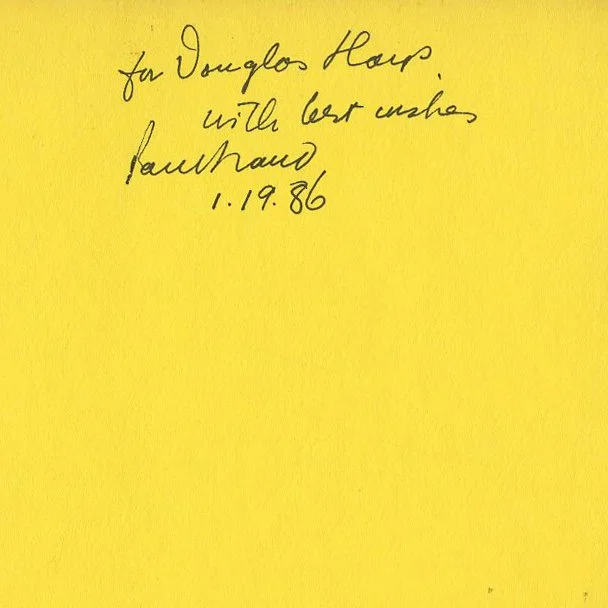
A DESIGNER'S ART
An Inscribed Copy
Paul Rand
New Haven: Yale University Press, 1985. First edition. Octavo. Black linen titled in gold. Printed dust jacket. Yellow endpapers. 240 pp. 55 color plates. 153 black and white illustrations. 27 illustrated essays. INSCRIBED on front free endpaper, otherwise interior unmarked and very clean. Multicolored spine lightly sunned, glossy black jacket faintly rubbed [as usual], otherwise a fine copy in a fine dust jacket.
Inscribed by Rand on front free endpaper: " for Doug Hays / with best wishes / Paul Rand / 1.19.86” Former owner was a student of Rands’ at Yale in the eighties.
7.75 x 10 hardcover edition with 240 pages and 153 b/w illustrations and 55 color plates of work samples by the author. 27 Collected essays and illustrations of the work of possibly the most influential graphic designer of them all. This book is a revised and updated version of Thoughts on Design, Rand's legendary first book from 1947.
Paul Rand was the first recipient of the Florence Prize for Visual Communication in 1987.
Contents:
art for art's sake
the beautiful and the useful
the designer's problem
the symbol in visual communication
versatility of the symbol
the trademark
seeing stripes
imagination and the image
integrating from and content
ideas about ideas
the meaningof repitition
the role of humor
the rebus and the visual pun
collage and montage
yesterday and today
typographic form and expression
about legibility
the good old Neue typografie
design and the play instinct
black black black
the art of the package: tomorrow and yesterday
the third dimension
the complexity of color
word pictures
the lesson of cezanne
politics of design
integrity and invention
"A monograph-cum-manifesto by America’s leading modernist designer and corporate communications pioneer. . . . This book describes design as a formal, aesthetic, and conceptual marriage of rationalism and wit." --Lingua Franca
. . . [He] describes his work with the same precision, economy, and passion he displays in his graphic designs, and he lets us understand the nature of his relationships with his clients, his audience, and his art." --Alan Fern, New York Times Book Review
"The outstanding design book of the year." --Thomas Hine, The Philadelphia Inquirer
"In a profession that is constantly pulled toward the banal, the trivial, and the predictable, the history of [Rand’s] accomplishment keeps us honest." --Milton Glaser
"In the future I will present this book to our Swiss printers as the measure of quality." --Josef Muller-Brockman, Zurich
If the word legend has any meaning in the graphic arts and if the term legendary can be applied with accuracy to the career of any designer, it can certainly be applied to Paul Rand (1914-1996). By 1947, the legend was already firmly in place. By then Paul had completed his first career as a designer of media promotion at Esquire-Coronet --and as an outstanding cover designer for Apparel Arts and Directions. He was well along on a second career as an advertising designer at the William Weintraub agency which he had joined as art director at its founding. THOUGHTS ON DESIGN (with reproductions of almost one hundred of his designs and some of the best words yet written on graphic design) had just published -- an event that cemented his international reputation and identified him as a designer of influence from Zurich to Tokyo.
A chronology of Rand's design experience has paralleled the development of the modern design movement. Paul Rand’s first career in media promotion and cover design ran from 1937 to 1941, his second career in advertising design ran from 1941 to 1954, and his third career in corporate identification began in 1954. Paralleling these three careers there has been a consuming interest in design education and Paul Rand's fourth career as an educator started at Cooper Union in 1942. He taught at Pratt Institute in 1946 and in 1956 he accepted a post at Yale University's graduate school of design where he held the title of Professor of Graphic Design.
In 1937 Rand launched his first career at Esquire. Although he was only occasionally involved in the editorial layout of that magazine, he designed material on its behalf and turned out a spectacular series of covers for Apparel Arts, a quarterly published in conjunction with Esquire. In spite of a schedule that paid no heed to regular working hours or minimum wage scales, he managed in these crucial years to find time to design an impressive array of covers for other magazines, particularly Directions. From 1938 on his work was a regular feature of the exhibitions of the Art Directors Club.
Most contemporary designers are aware of Paul Rand's successful and compelling contributions to advertising design. What is not well known is the significant role he played in setting the pattern for future approaches to the advertising concept. Rand was probably the first of a long and distinguished line of art directors to work with and appreciate the unique talent of William Bernbach. Rand described his first meeting with Bernbach as "akin to Columbus discovering America," and went on to say, "This was my first encounter with a copywriter who understood visual ideas and who didn't come in with a yellow copy pad and a preconceived notion of what the layout should look like."
Rand spent fourteen years in advertising where he demonstrated the importance of the art director in advertising and helped break the isolation that once surrounded the art department. The final thought from THOUGHTS ON DESIGN is worth repeating: "Even if it is true that commonplace advertising and exhibitions of bad taste are indicative of the mental capacity of the man in the street, the opposing argument is equally valid. Bromidic advertising catering to that bad taste merely perpetuates that mediocrity and denies him one of the most easily accessible means of aesthetic development."
In 1954 when Paul Rand decided Madison Avenue was no longer a two-way street and he resigned from the Weintraub agency, he was cited as one of the ten best art directors by the Museum of Modern Art. The rest is design history.
Laszlo Moholy-Nagy, a pioneer typographer, photographer, and designer of the modern movement and a master at the Bauhaus in Weimar, may have come closest to defining the Rand style when he said Paul was "an idealist and a realist using the language of the poet and the businessman. He thinks in terms of need and function. He is able to analyze his problems, but his fantasy is boundless."
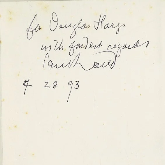
DESIGN FORM AND CHAOS
An Inscribed Copy
Paul Rand
New Haven: Yale University Press, 1993. First edition. Octavo. Full debossed charcoal linen titled in white. Printed dust jacket. Black endpapers. 220 pp. Fully illustrated in color and black and white. 14 illustrated essays. INSCRIBED on front free endpaper, otherwise interior unmarked and very clean. Trivial handling wear overall, otherwise a fine copy in a fine dust jacket.
Inscribed by Rand on front free endpaper: " for Doug Hays / with fondest regards / Paul Rand / 4.28.93” Former owner was a student of Rands’ at Yale in the eighties.
7.75 x 10 hardcover edition with 220 pages fully illustrated in color and black and white. 14 essays and illustrations of the work of possibly the most influential graphic designer of them all.
Contents:
Introduction
Form + Content
Good Design is Goodwill
Intuition and Ideas
Logos . . . Flags . . . Street Signs
The Presentation
NeXT
The Limited
The Logo
AdStar Advanced Storage and Retrieval
IDEO Design
Morningstar Investment Advisers
Computers, Pencils, and Brushes
Aspects of Book Design
A Mentor
From Cassandre to Chaos
If the word legend has any meaning in the graphic arts and if the term legendary can be applied with accuracy to the career of any designer, it can certainly be applied to Paul Rand (1914-1996). By 1947, the legend was already firmly in place. By then Paul had completed his first career as a designer of media promotion at Esquire-Coronet --and as an outstanding cover designer for Apparel Arts and Directions. He was well along on a second career as an advertising designer at the William Weintraub agency which he had joined as art director at its founding. THOUGHTS ON DESIGN (with reproductions of almost one hundred of his designs and some of the best words yet written on graphic design) had just published -- an event that cemented his international reputation and identified him as a designer of influence from Zurich to Tokyo.
A chronology of Rand's design experience has paralleled the development of the modern design movement. Paul Rand’s first career in media promotion and cover design ran from 1937 to 1941, his second career in advertising design ran from 1941 to 1954, and his third career in corporate identification began in 1954. Paralleling these three careers there has been a consuming interest in design education and Paul Rand's fourth career as an educator started at Cooper Union in 1942. He taught at Pratt Institute in 1946 and in 1956 he accepted a post at Yale University's graduate school of design where he held the title of Professor of Graphic Design.
In 1937 Rand launched his first career at Esquire. Although he was only occasionally involved in the editorial layout of that magazine, he designed material on its behalf and turned out a spectacular series of covers for Apparel Arts, a quarterly published in conjunction with Esquire. In spite of a schedule that paid no heed to regular working hours or minimum wage scales, he managed in these crucial years to find time to design an impressive array of covers for other magazines, particularly Directions. From 1938 on his work was a regular feature of the exhibitions of the Art Directors Club.
Most contemporary designers are aware of Paul Rand's successful and compelling contributions to advertising design. What is not well known is the significant role he played in setting the pattern for future approaches to the advertising concept. Rand was probably the first of a long and distinguished line of art directors to work with and appreciate the unique talent of William Bernbach. Rand described his first meeting with Bernbach as "akin to Columbus discovering America," and went on to say, "This was my first encounter with a copywriter who understood visual ideas and who didn't come in with a yellow copy pad and a preconceived notion of what the layout should look like."
Rand spent fourteen years in advertising where he demonstrated the importance of the art director in advertising and helped break the isolation that once surrounded the art department. The final thought from THOUGHTS ON DESIGN is worth repeating: "Even if it is true that commonplace advertising and exhibitions of bad taste are indicative of the mental capacity of the man in the street, the opposing argument is equally valid. Bromidic advertising catering to that bad taste merely perpetuates that mediocrity and denies him one of the most easily accessible means of aesthetic development."
In 1954 when Paul Rand decided Madison Avenue was no longer a two-way street and he resigned from the Weintraub agency, he was cited as one of the ten best art directors by the Museum of Modern Art. The rest is design history.
Laszlo Moholy-Nagy, a pioneer typographer, photographer, and designer of the modern movement and a master at the Bauhaus in Weimar, may have come closest to defining the Rand style when he said Paul was "an idealist and a realist using the language of the poet and the businessman. He thinks in terms of need and function. He is able to analyze his problems, but his fantasy is boundless."
![Interiors, February 1959. New York: Whitney Publications, Olga Gueft [Editor], Alexander Girard Herman Miller Barbary Coast Showroom.](https://images.squarespace-cdn.com/content/v1/6a074f91e54cbe1a0e669fb9/0bb504d3-d4b8-4266-8552-051be43e6039/interiors_1959_02_thumb.jpg)
Interiors
February 1959
Olga Gueft [Editor]
New York: Whitney Publications, Volume 118, no. 7, February 1959. Original edition. Slim quarto. Perfect bound and sewn printed illustrated wrappers. 144 pp. Illustrated articles and trade advertisements. Cover by Arnold Saks. Very light wear overall: a very good or better copy.
9 x 12 magazine with 144 pages of olor and black and white examples of the best modern American interior and industrial design, circa 1959 -- offering a magnificent snapshot of the blossoming modern movement after World War II. A very desirable, vintage publication in terms of form and content: high quality printing and clean, functional design and typography and excellent photographic reproduction make this a spectacular addition to a midcentury design collection. Highly recommended.
Contents include:
Interiors' Contract Series '59: Restaurants
Playbill Restaurant by Melani Kahane Assoc.
Guildhall Ballroom by Everett Brown Assoc.
The Continental by Lapidus, Kornblath, Harle & O'Mara
Ondine Restaurant by Campbell & Wong
Red Rose Restaurant by Design Research Unit, London
Yankee Stadium Club by Eleanoe LeMaire
University Club Grill by Chandler Cudlipp Assoc.
Hans Wegner's One Man Show at Georg Jensen
Barbary Coast: Girard Designs a New Herman Miller Showroom. 6 pages with 8 color and black and white photographs by Charles Eames.
The Sculptural Environment of Wharton Esherick
Furniture Report, Part I: includes Dunbar, Laverne
Includes advertising [many full page and/or color] from the following manufacturers and companies: Herman Miller [full page ad], Lightolier, George Tanier Inc. [Hans Wegner Storage Unit], Janet Rosenblum and Charak Modern among others.
George Nelson famously served as Editorial contributor to Interiors, where he used the magazine as his bully pulpit for bringing modernism to middle-class America. Interiors was a hard-core interior design publication, as shown by their publishing credo: "Published for the Interior Designers Group which includes: interior designers, architects who do interior work, industrial designers who specialize in interior furnishings, the interior decorating departments of retail stores, and all concerned with the creation and production of interiors-- both residential and commercial."
Interiors during its peak in the 1950s was the most beautfully designed and printed American Interiors magazine I have seen. An amazing vintage mid-century resource, not to be missed. Excellent vintage resource for wallpaper, rugs and floorware, funiture, lighting, decorative objects, etc.
![Interiors, June 1959. New York: Whitney Publications, Volume 118, no. 11, Olga Gueft [Editor].](https://images.squarespace-cdn.com/content/v1/6a074f91e54cbe1a0e669fb9/af82e07d-ec48-4233-8001-efa4cb57025e/interiors_1959_06_thumb.jpg)
Interiors
June 1959
Olga Gueft [Editor]
New York: Whitney Publications, Volume 118, no. 11, June 1959. Original edition. Slim quarto. Perfect bound and sewn printed illustrated wrappers. 160 pp. Illustrated articles and trade advertisements. Cover by Arnold Saks, photograph by Gordon Summers. Light wear overall: a very good or better copy.
9 x 12 magazine with 52 pages of color and black and white examples of the best modern American interior and industrial design, circa 1959 -- offering a magnificent snapshot of the blossoming modern movement after World War II. A very desirable, vintage publication in terms of form and content: high quality printing and clean, functional design and typography and excellent photographic reproduction make this a spectacular addition to a midcentury design collection. Highly recommended.
Contents include:
The Sheraton - Dallas by Welton Beckett & Mary Morrison Kennedy
Interiors' Contract Series '59: Stores
Joseph Magnin, Las Vegas by Victor Gruen Assoc.
The Hecht Co., Hyattsville by Daniel Schwartzman
Hutzler's Westview by Ketchum & Sharp
Takashimaya on Fifth Avenue by Junzo Yoshimura
Brasilia: Niemeyer's Presidential Palace for Brazil's New Capital
City and Country residences by Michael Greer
Fiberglass Fabric Center by Maria Bergson Assoc.
Phantom Setting for Glass: Steuben Glass Shop
Furniture Maker's Modern: Winsor White's New Designs for Baker
New Forms in Molded Chairs: Paul McCobb and Arne Jacobsen
George Nelson famously served as Editorial contributor to Interiors, where he used the magazine as his bully pulpit for bringing modernism to middle-class America. Interiors was a hard-core interior design publication, as shown by their publishing credo: "Published for the Interior Designers Group which includes: interior designers, architects who do interior work, industrial designers who specialize in interior furnishings, the interior decorating departments of retail stores, and all concerned with the creation and production of interiors-- both residential and commercial."
Interiors during its peak in the 1950s was the most beautifully designed and printed American Interiors magazine I have seen. An amazing vintage mid-century resource, not to be missed. Excellent vintage resource for wallpaper, rugs and floorware, furniture, lighting, decorative objects, etc.
![Interiors, May 1954. New York: Whitney Publications, Olga Gueft [Editor], cover by Roberto Mango.](https://images.squarespace-cdn.com/content/v1/6a074f91e54cbe1a0e669fb9/5767d00f-f038-4cdc-8ddc-dbe9ad858ad5/Interiors_1954_05_thumb.jpg)
Interiors
May 1954
Olga Gueft [Editor]
New York: Whitney Publications, Volume 113, no. 10, May 1954. Original edition. Slim quarto. Perfect bound and sewn printed illustrated wrappers. 190 pp. Illustrated articles and trade advertisements. Cover by Roberto Mango. Wrappers lightly worn and soiled, coffee strain [?] to rear panel, but a very good or better copy.
9 x 12 magazine with 190 pages of color and black and white examples of the best modern American interior and industrial design, circa 1954 -- offering a magnificent snapshot of the blossoming modern movement after World War II. A very desirable, vintage publication in terms of form and content: high quality printing and clean, functional design and typography and excellent photographic reproduction make this a spectacular addition to a midcentury design collection. Highly recommended.
Contents include:
Cover artist portrait and short biography of Andy Warhol.
23rd annual conference of the American Institute of Decorators in Chicago
An interior to come by Melanie Kahane, A.I.D.
Results of the A.I.D. competitions
Contracts with manufacturers
Pieds a terre by the A.I.D. president C. Eugene Stephenson
The apt duplex of an antiques man by Yale R. Burge, A.I.D.
The avant garde in the provinces: modern retail in New Orleans, Houston and Grosse Pointe
Design in Scandinavia: a review by Edgar Kaufmann, Jr. [6 pages with 17 b/w illustrations including work by Eric Herlow, Finn Juhl, Hans Wegner, Timo Sarpaneva and Ingeborg Lundin]
Contemplative stage for philosophers by Edward L. Barnes: 2 pages with 3 b/w illustrations of the New York home of the United Lodge of Theosophists
Ettore Sottsass loops brass around Plexiglas: 2 pages with 5 b/w illustrations of bowls and vases by the Italian architect
A source that shows Sweden's mettle: Swedish Modern [2 pages with 6 b/w illustrations]
The Tillets weave and print improved Fiberglas
Breger-Salzman's new collection for Grosfeld House: 2 pages with 9 b/w illustrations
Rugs and carpets '54: Interiors' annual review [6 well-illustrated pages]
Directional's redecoration: the compleat McCobb [1 page with 3 b/w illustrations]
Parzinger provides a provocative medley
African masks by Arthur Nelson Snyder
Vintage advertisements for Knoll, Harvey Probber, Herman Miller, Boris Kroll Fabrics, Lehigh, Paul McCobb for Directional, Kagan-Dreyfuss, Jens Risom Design, M. Singer and Sons, Ben Rose, Swedish Modern, Howard Miller Clock [George Nelson bubble lamps], Vakassian and Sons, Raymor and Thonet among others.
In 1954 the four Scandinavian countries, Denmark, Sweden, Norway and Finland arranged what proved to be the most important marketing effort ever for Scandinavian design—the monumental exhibition Design in Scandinavia. From 1954 to 1963 Design in Scandinavia toured the United States and Canada. The exhibition was presented in 27 cities, and it was a huge success, initiated by The Danish Society of Arts and Crafts and its sister organizations in the other participating countries.
Based on the success the four countries established what they called the Scandinavian Design Cavalcade, which had a lot of US press coverage as well. In that connection the July 1963 issue of House Beautiful was centered around The Scandinavian Look in U.S. Homes, and it was Denmark and Danish Design in particular that the magazine focussed on. Besides the editorial pages, the numerous ads illustrates that Danish modern furniture was increasingly gaining a stronghold among certain groups of American consumers.
Importers and retail chains like John Stuart Inc., George Tanier, Raynor and Dunbar etc. now sold Danish modern furniture in the US, and by now it was not only hand crafted furniture from the Copenhagen Cabinetmakers’ Guild Exhibitions but also pieces from industrial furniture producers like Fritz Hansen, Søborg Møbelfabrik, Fredericia Furniture and many others. From the end of the 1950s Danish Department stores and other retailers produced comprehensive brochures and booklets in English with prices in US Dollars presenting Danish Design to American and other tourists.
Without exception, these stores all presented the narrative of Danish modern. “Denmark is known all over the world for its exquisite home furnishing, which are characterized by their outstanding design and superb craftsmanship” the department store Magasin claimed in its brochure “Danish Design.”
George Nelson famously served as Editorial contributor to Interiors, where he used the magazine as his bully pulpit for bringing modernism to middle-class America. Interiors was a hard-core interior design publication, as shown by their publishing credo: "Published for the Interior Designers Group which includes: interior designers, architects who do interior work, industrial designers who specialize in interior furnishings, the interior decorating departments of retail stores, and all concerned with the creation and production of interiors-- both residential and commercial."
Interiors during its peak in the 1950s was the most beautfully designed and printed American Interiors magazine I have seen. An amazing vintage mid-century resource, not to be missed. Excellent vintage resource for wallpaper, rugs and floorware, funiture, lighting, decorative objects, etc.
![Interiors, April 1954. New York: Whitney Publications, Olga Gueft [Editor], Cover by Martin Rosenweig.](https://images.squarespace-cdn.com/content/v1/6a074f91e54cbe1a0e669fb9/053845cb-853f-4eec-9acc-9f1be11a2fd2/Interiors_1954_04_thumb.jpg)
Interiors
April 1954
Olga Gueft [Editor]
New York: Whitney Publications, Volume 113, no. 9, April 1954. Original edition. Slim quarto. Perfect bound and sewn printed illustrated wrappers. Illustrated articles and trade advertisements. Cover by Martin Rosenweig. Wrappers lightly worn and somewhat soiled at fore edge, but a very good copy.
9 x 12 magazine with color and black and white examples of the best modern American interior and industrial design, circa 1954 -- offering a magnificent snapshot of the blossoming modern movement after World War II. A very desirable, vintage publication in terms of form and content: high quality printing and clean, functional design and typography and excellent photographic reproduction make this a spectacular addition to a midcentury design collection. Highly recommended.
Contents include:
Victor Gruen’s duplex
R. Buckminster Fuller's Geodesic Dome at the Tenth Triennale di Milano
Fabrics ’54: Lucienne Day, Ben Rose, Paul McCobb, Angelo Testa, Pipsan Saarinen Swanson, Dorothy Liebes,
Furniture '54: first half of a market preview [14 pages with 70 b/w illustrations including Allan Gould, Glenn of California [Greta Grossman], Herman Miller [Charles Eames, George Nelson], Directional [Paul McCobb], Harvey Probber, Knoll [Florence Knoll, Kurt Nordstrom, Harry Bertoia], Dunbar [Edward Wormley], M. Singer [Carlo di Carli, Milan Design Group], Dux [Folke Ohlsson, Alf Svenson], Richard Morgenthau [Arne Jacobsen] and John Stuart [Peter Hvidt] among others.
Merchanidise Cues with Ben Seibel, Jack Squir, Lucie Rie; the Tri-Lamp Co., Lightolier, Isamu Noguchi, Richards Morgenthal, the Heifetz Studio, Nessen Studio, and more.
Vintage advertisements for Knoll, Harvey Probber, Herman Miller, Boris Kroll Fabrics, Lehigh, Paul McCobb for Directional, Kagan-Dreyfuss, Jens Risom Design, M. Singer and Sons, Ben Rose, Swedish Modern, Howard Miller Clock Co., Raymor, Vakassian and Sons, Raymor and Thonet among others.
George Nelson famously served as Editorial contributor to Interiors, where he used the magazine as his bully pulpit for bringing modernism to middle-class America. Interiors was a hard-core interior design publication, as shown by their publishing credo: "Published for the Interior Designers Group which includes: interior designers, architects who do interior work, industrial designers who specialize in interior furnishings, the interior decorating departments of retail stores, and all concerned with the creation and production of interiors-- both residential and commercial."
Interiors during its peak in the 1950s was the most beautfully designed and printed American Interiors magazine I have seen. An amazing vintage mid-century resource, not to be missed. Excellent vintage resource for wallpaper, rugs and floorware, funiture, lighting, decorative objects, etc.
![Interiors and Industrial Design, October 1946. New York: Whitney Publications [Volume 106, no. 3].](https://images.squarespace-cdn.com/content/v1/6a074f91e54cbe1a0e669fb9/5e575969-e87f-490c-94d7-e12220916974/interiors_1946_10_thumb.jpg)
Interiors and Industrial Design
October 1946
Francis de N. Schroeder [Editor]
New York: Whitney Publications, Volume 106, no. 3, October 1946. Original edition. Quarto. Perfect bound and sewn printed illustrated wrappers. 178 pp. Illustrated articles and trade advertisements. Cover by James Lamantia. Spine crown and heel chipped. Wrappers worn, creased and soiled, especially to rear panel, but a very good copy.
9 x 12 magazine with 178 pages of color and black and white examples of the best modern American interior and industrial design, circa 1946 -- offering a magnificent snapshot of the blossoming modern movement after World War II. A very desirable, vintage publication in terms of form and content: high quality printing and clean, functional design and typography and excellent photographic reproduction make this a spectacular addition to a midcentury design collection. Highly recommended.
Contents include:
Letter to the editor from Charles Eames [Venice, Ca] with a photograph of the author.
Illustrated profiles of cover artists: Bernard Rudofsky, Saul Steinberg and Alvin Lustig.
How To Display Furniture: Edward Wormley Demonstrates On Behalf Of Dunbar
The Hotel: Its History, Development And Its Present Design Problems
Guild Galleries In Grand Rapids Open Their Doors
Variations On The Theme Of Plywood: Sears, Ottinger And Richards Create A Weldwood Building
Interiors For A Tycoon's Yacht By George Farkas
Beverly And Valentine Design Cameo Restaurant In Chicago
Suggestions Of Three Kings; Chicago Restaurant By Mabel Schamberg
Fine Stuffs: Fabrics By Graham Sutherland, Hans Tisdall, Saul Steinberg, Ben Rose, Donelda Fazakas, etc.
Industrial Design: Cars By Lawrence Webb Yaggi; Francesco Collura; Adler, Stahl and Radcliffe
Advertisements for Laverne Originals, Dunbar, etc.
And much more.
George Nelson famously served as Editorial contributor to Interiors, where he used the magazine as his bully pulpit for bringing modernism to middle-class America. Interiors was a hard-core interior design publication, as shown by their publishing credo: "Published for the Interior Designers Group which includes: interior designers, architects who do interior work, industrial designers who specialize in interior furnishings, the interior decorating departments of retail stores, and all concerned with the creation and production of interiors-- both residential and commercial."
Interiors during its peak in the 1950s was the most beautfully designed and printed American Interiors magazine I have seen. An amazing vintage mid-century resource, not to be missed. Excellent vintage resource for wallpaper, rugs and floorware, funiture, lighting, decorative objects, etc.
![Interiors and Industrial Design, January 1951. New York: Whitney Publications [Volume 109, no. 6].](https://images.squarespace-cdn.com/content/v1/6a074f91e54cbe1a0e669fb9/c41c270f-e2cd-47bf-af1a-e2c4cf819c86/interiors_1951_01_thumb.jpg)
Interiors and Industrial Design
January 1951
Francis de N. Schroeder [Editor]
New York: Whitney Publications [Volume 109, no. 6]: January 1951]. Original edition. Slim quarto. Perfect bound and sewn printed illustrated wrappers. 168 pp. Illustrated articles and trade advertisements. Multiple fold outs and one printed vellum overlay. Cover by Pierre Kleykamp. Interior unmarked and clean. The Rudolph and Twitchell fold out misfolded so the top edge protrudes over the upper textblock. Spine crown and heel slightly worn. Wrappers with mild soiling and edge wear, but a very good or better copy.
9 x 12 magazine with approximately 168 pages of color and black and white examples of the best modern American interior and industrial design, circa 1951 -- offering a magnificent snapshot of the blossoming modern movement after World War II. A very desirable, vintage publication in terms of form and content: high quality printing and clean, functional design and typography and excellent photographic reproduction make this a spectacular addition to a midcentury design collection. Highly recommended.
Excellent original edition of Interiors with stunning visual content:
new Raymond Loewy interiors
Le Corbusier’s Marseille Apartment house.“Le Corbusier's most influential late work was his first significant postwar structure—the Unité d'Habitation in Marseilles of 1947-52. The giant, twelve-story apartment block for 1,600 people is the late modern counterpart of the mass housing schemes of the 1920s, similarly built to alleviate a severe postwar housing shortage.
Full-page two-color ad for the brand new Eames Fibreglass Chairs for the Herman Miller Furniture Company, designed by the Eames Office, I might add.
Interiors to come: designs by Gyorgy Kepes, Campbell and Wong, Rudolph and Twitchell [with fold-out], the Architects Collaborative, Greta Magnusson Grossmann, James Lamantia [with fold out], Robert Heller, Paul Beidler, Kaneji Domoto, K. H. Cheang and Dahong Wong, Lester Tichy, Paul Jacques Grillo, etc.
Merchandise Cues: fabrics, wallpapers, furniture, lamps, tableware, accessories, floor coverings, etc.
Advertising (many full-page and/or color) from the following manufacturers and companies: Century Lighting, Directional Modern Showrooms, Dunbar Furniture Corp., Hanson, Heifetz, Lightolier, Herman Miller Furniture Company, Harvey Probber, Raymor, Ben Rose, John Stuart, and many others.
and much, much more!
George Nelson famously served as Editorial contributor to Interiors, where he used the magazine as his bully pulpit for bringing modernism to middle-class America. Interiors was a hard-core interior design publication, as shown by their publishing credo: "Published for the Interior Designers Group which includes: interior designers, architects who do interior work, industrial designers who specialize in interior furnishings, the interior decorating departments of retail stores, and all concerned with the creation and production of interiors-- both residential and commercial."
Interiors during its peak in the 1950s was the most beautfully designed and printed American Interiors magazine I have seen. An amazing vintage mid-century resource, not to be missed. Excellent vintage resource for wallpaper, rugs and floorware, funiture, lighting, decorative objects, etc.
![Teague, Walter Dorwin: DESIGN THIS DAY [The Technique Of Order In The Machine Age]. New York: Harcourt Brace and Company, 1940.](https://images.squarespace-cdn.com/content/v1/6a074f91e54cbe1a0e669fb9/1aa1d3f4-1d56-4959-b370-907a262a46ee/teague_design_day_thumb.jpg)
DESIGN THIS DAY
The Technique Of Order In The Machine Age
Walter Dorwin Teague
New York: Harcourt Brace and Company, 1940. First edition. Quarto. Publishers navy cloth stamped in gilt. Photographic illustrated dust jacket. 291 pp. 128 plates with 163 halftone illustrations. Typography by Robert Josephy. Jacket with trivial chipping to lower edge and a pair of short, closed tears to rear panel. Cloth and edges clean and sharp. A remarkably well preserved copy: a fine copy in a nearly fine dust jacket.
7.25 x 9.5 hardcover book with 291 pages and 128 plates with 163 halftone illustrations. Book typography by Robert Josephy. A classic of industrial design by the founder and first president of the American Society of Industrial designers. "...A discussion of the technique to be employed--the standards and methods to be used--in the physical process of rebuilding our world," toward a better, even utopian society.”
Includes work by Margaret Bourke-White, Albert Kahn, Edward Steichen, Raymond Hood, Frank Lloyd Wright, Howe And Lescaze, George Howe, A. Lawrence Kocher, Albert Frey, Kenneth Day, Clarence Mayhew and many others.
During Walter Dorwin Teague's time, industrial designers were transforming ordinary objects by marrying materials, technique and function to produce the simplest and most efficient forms possible. The resulting products had an appearance that was a stark visual break from the past. Practitioners of this style of design, known as streamlining, art moderne or art deco, did away with most nonfunctional elements in favor of sleek designs. Their efforts transformed everything from automobiles, trains, ships and airplanes to cameras, buildings, furniture and appliances.
The trend began in the mid-1920s as an attempt by manufacturers to increase sales of consumer goods in a saturated marketplace by giving them a distinctive and modern look. At the most idealistic level, as exemplified by Teague, the new designs and the improved function they represented could be a force for good. "A better world than we have ever known can and will be built," Teague said. "Our better world may be expected to make equally available for everybody such rare things as interesting, stimulating work, emancipation from drudgery and a gracious setting for daily life."
Teague detailed his industrial and artistic philosophy in Design This Day, first published in 1940. His book appeared at about the time Hitler was invading Norway--before the United States entered World War II--and toward the end of the Great Depression. "We walk between catastrophe and apotheosis," he declared in Design This Day. "In spite of the mighty destructive powers that threaten us, our vision of a desirable life was never so clear and our means of realizing it never so ample."
Along with designers Norman Bel Geddes, Henry Dreyfuss and Raymond Loewy, Teague helped create the industrial design profession in America, defining the visual character of the 1930s and 1940s in the process.
He started his career in graphic arts, painting signs and drawing for catalogs, and later worked in advertising. A 1926 trip to Paris introduced him to new ideas in design. He returned believing that unity of design could create a more orderly world and decided to become an industrial designer. Teague started his own industrial design firm and received his first commission in 1927, designing cameras for Eastman Kodak. The relationship lasted for 30 years.
In 1936 he placed his signature on American roadsides. Texaco replaced its regionally styled gas stations with a single design--green and white porcelain-enamel stations designed by Teague. The clean look, highlighted with red stars, was easily identified by motorists. Although some of Teague's utopian ideals and radical design concepts never materialized, he was clearly a visionary. And we are still intrigued by his desire to build a better world.
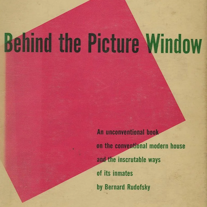
BEHIND THE PICTURE WINDOW
Bernard Rudofsky
New York: The Oxford University Press, 1955. First edition. Octavo. Yellow cloth titled in red. Printed dust jacket. 201 pp. Lightly illustrated with halftones and line art. Dust jacket designed by Paul Rand. Price clipped jacket lightly soiled with a pushed spine crown resulting in a small closed tear. A fine copy in a very good or better dust jacket.
“The author’s title for this book is Uncle Sam’s Cabin. Due to circumstances beyond his control, it is now called Behind the Picture Window.”— Frontis
5.85 x 8.75-inch hardcover book with 201 pages illustrated with halftones and line art. Perhaps best viewed as a book length response to Russel and Mary Wright’s Guide to Easier Living, Mr. Rudofsky writes with great wit as he rebukes the aesthetic and sensuous poverty of our domestic environment, offering an antidote to anodyne shelter magazine pronouncements and to many of the prescriptions of high modernism--especially as regards clutter. As he puts it, “A house which does not burst its bounds with overcrowding does not seem to hold the promise of a decent life.”
The New York Times reviewed this book in 1955: “Clutter Can Be Beautiful; BEHIND THE PICTURE WINDOW. By Bernard Rudofsky. Illustrated. 201 pp. New York: Oxford University Press. $4.
“UNLIKE many authors, Bernard Rudofsky, architect, and industrial designer, is a modest man. He tells us that this collection of essays about humans and their houses fills no need. This is an error that must be corrected at once. If you have grown weary of the solemn pronouncements of the editors of our better magazines for home-owners, here is just the relief you require. Mr. Rudofsky is also a wise man. He sees no reason to take anyone seriously except himself. In case you have read one essay too many on party-giving, it will pay you to listen to Mr. Rudofsky. He will inform you that knives and forks are barbaric, and that the art of carving ought to have died out in the Dark Ages. “We should," he writes, "taboo carving at meals, if only to protect the less sanguine eaters from having to witness or perform dining-table surgery." Furthermore, he insists that we ought to lie down at dinner. After all, "modern chairs are just so many challenges to acrobatic talents." He admits, however, to a certain fondness for a dining-chair with a built-in weighing machine, and he points out the virtues of the vibrating chair, constructed on the principle of the milk-shake. There may be such a thing, the author argues, as too much music in the American home. One of his favorite candidates for oblivion is the late J. Leonard Corning, M. D., who sought to find "an inexpensive and anti-toxic remedy against thinking." Perhaps the doctor delivered his message too soon." Had he lived longer (he died in 1923) he would have been able, to see his therapeutics of the emotions put to use on a nation-wide scale. Radio was a beginning.” Mr. Rudofsky implies, “that no hi-fi cabinet can compare with a good stove."Art has always flourished in countries where good food was highly thought of," he reminds us. Besides, “the kitchen may provide a last refuge from our aching boredom.” He himself is bored with our bedrooms and bathrooms, not to mention our front lawns, which should be fenced off to provide the privacy we crave. NEEEDLESS to say, the author refuses to endorse the current campaign for uncluttered interiors. "A house which does not burst its bounds with overcrowding does not seem to hold the promise of a decent life," he believes. He adds that “dignity has suffered defeat after defeat, to the extent where our houses become laboratories for determining the breaking point of the human fiber. The fact cannot be ignored that we are making a fetish of minimum space." Though Mr. Rudofsky may not be invited to address the next annual convention of the American Institute of Decorators (they could scarcely forgive his yearning for cluttered rooms) he has probably made many more friends than enemies by writing this book. Among his warmest admirers will be counted many modern architects. They are not all so serious-minded as they have been advertised. Mr. Andrews, curator of manuscripts at the New York Historical Society, is the author of "Architecture, Ambition and Americans.”
Excerpted from a Museum of Moder Art press release: “An architect friend of Mr. Rudofsky, Felix Augenfeld, has written the following engaging sketch of him:
“Bernard Rudofsky is of the disapproving kind. His disapproval of the institutions of this world reaches a very unusual degree of intensity, a degree which makes his keen displeasure turn into creative impulse. And since he disapproves of many more things than the average person, he finds that, at the age of 39, he has "been successfully active in a number of varied fields. He is, or has been, an architect, engineer, industrial designer, stage designer, editor, musician, actor, fashion designer, shoemaker, archeologist, photographer and typographer. He considers human dwellings the crowning failure of mankind and has therefore made architecture his main profession.
“Like every Viennese he likes music and the stage. His other passion is traveling on which he has spent one-third of his time and every single penny he could spare. Thus he became acquainted with the Balkans and their primitive ways of living, with Asia Minor and Greece, where money is non-essential, with Switzerland, France, Scandinavia and the old Weimar Germany. He has come to the conclusion that people fight and quibble because of lack of privacy, dress stupidly, eat badly, and drink only to stop worrying.
“In 1931 he left Berlin and his architectural work to go South and find out how to enjoy life, to build and to work intelligently. For the next five years he indulged in his passion for living on remote Mediterranean islands like Procida, Ischia, Capri. A house he designed for himself was forbidden by the Military High Command since it was windowless and of such unusual design that it aroused suspicion.
“Mr. Rudofsky has frequently exposed himself voluntarily to the refreshing experience of starting life in a new country. He is in the habit of arriving there without any money in his pocket and of leaving for another country the very moment he is threatened with financial success. He had his narrowest escape in Milan, Italy, where in 1937 he was planning hotels radically different from today’s pattern and where he was editing and writing for a magazine of art and architecture.
“In 1938 he settled in Buenos Aires, but the winter climate drove him to tropical Rio de Janeiro. During three years of architectural work in Brazil he built some houses which in Europe were considered the -best on the American continent. Of his work Sacheverell Sitwell said, '...in the space of three years he built a pair of private houses that in their way are among the greatest successes of the whole modern movement. The Arnstein House...has been described as the most beautiful house in the entire American continent.
“He came to the United States three years ago when he won a prize in the Industrial Design Competition sponsored by the Museum of Modern Art. After learning his fifth language, he worked for a year as associate editor and art director of an architectural magazine.
“Most of Mr. Rudofsky’s time is spent on what seems to everyone most unrewarding and impractical--study and reading, collecting material in support of his favorite idea: that modern architecture is Just another kind of failure. He believes it is bound to be so because architecture is the most integrated expression of our way of living. In order to create good architecture ways of living must be critically investigated. Thus a revised scale o£ values has to be applied to the functions of our daily life, such as eating, drinking, sleeping, dressing, music making, recreation and social life. Architecture in the broader sense in which he conceives it has to be approached by readjusting the elements on which it is based.”
Bernard Rudofsky (Moravia, 1905 – 1988) was an American writer, architect, collector, teacher, designer, and social historian. Ada Louise Huxtable called him “the master iconoclast of the modern movement.”
Rudofsky earned a doctorate in architecture in Austria before working in Germany, Italy, and a dozen other countries. He temporarily settled in Brazil in the 1930s and opened an architectural practice there, building several notable residences in São Paulo. An entry in a 1941 design competition brought an invitation from MOMA to tour the US; in the wake of Pearl Harbor, as an Austrian native, he was given the option of staying in the US. He remained based in New York City until his death, although he continued to travel (sometimes for years at a stretch). Rudofsky variously taught at Yale, MIT, Cooper-Hewitt, Waseda University in Tokyo, and the Royal Academy of Fine Arts in Copenhagen. He was a Ford, Fulbright and Guggenheim Fellow.
Rudofsky was most influential for organizing a series of controversial MOMA exhibits in the 1940s, 1950s and 1960s. He is best remembered today for a number of urbane books that still provide relevant design insight that is concealed in entertaining, subversive sarcasm. His interests ranged from vernacular architecture to Japanese toilets and sandal design. Taken together, his written work constitutes a sustained argument for humane and sensible design.
In 1944 Rudofsky and his wife Berta were invited to Black Mountain College for two weeks. Bernard gave two lectures on the sad state of clothing design, calling contemporary dress "anachronistic, irrational, impractical and harmful" and literally unsuitable. One of his lectures was called "How Can People Expect to Have Good Architecture When They Wear Such Clothes?" Berta was convinced to organize an impromptu course on sandalmaking. Berta was invited back the following year, and their successful venture Bernardo Sandals was organized in 1947 and still thrives.
If the word legend has any meaning in the graphic arts and if the term legendary can be applied with accuracy to the career of any designer, it can certainly be applied to Paul Rand (1914-1996). By 1947, the legend was already firmly in place. By then Paul had completed his first career as a designer of media promotion at Esquire-Coronet --and as an outstanding cover designer for Apparel Arts and Directions. He was well along on a second career as an advertising designer at the William Weintraub agency which he had joined as art director at its founding. THOUGHTS ON DESIGN (with reproductions of almost one hundred of his designs and some of the best words yet written on graphic design) had just published -- an event that cemented his international reputation and identified him as a designer of influence from Zurich to Tokyo.
A chronology of Rand's design experience has paralleled the development of the modern design movement. Paul Rand’s first career in media promotion and cover design ran from 1937 to 1941, his second career in advertising design ran from 1941 to 1954, and his third career in corporate identification began in 1954. Paralleling these three careers there has been a consuming interest in design education and Paul Rand's fourth career as an educator started at Cooper Union in 1942. He taught at Pratt Institute in 1946 and in 1956 he accepted a post at Yale University's graduate school of design where he held the title of Professor of Graphic Design.
In 1937 Rand launched his first career at Esquire. Although he was only occasionally involved in the editorial layout of that magazine, he designed material on its behalf and turned out a spectacular series of covers for Apparel Arts, a quarterly published in conjunction with Esquire. In spite of a schedule that paid no heed to regular working hours or minimum wage scales, he managed in these crucial years to find time to design an impressive array of covers for other magazines, particularly Directions. From 1938 on his work was a regular feature of the exhibitions of the Art Directors Club.
Most contemporary designers are aware of Paul Rand's successful and compelling contributions to advertising design. What is not well known is the significant role he played in setting the pattern for future approaches to the advertising concept. Rand was probably the first of a long and distinguished line of art directors to work with and appreciate the unique talent of William Bernbach. Rand described his first meeting with Bernbach as "akin to Columbus discovering America," and went on to say, "This was my first encounter with a copywriter who understood visual ideas and who didn't come in with a yellow copy pad and a preconceived notion of what the layout should look like."
Rand spent fourteen years in advertising where he demonstrated the importance of the art director in advertising and helped break the isolation that once surrounded the art department. The final thought from THOUGHTS ON DESIGN is worth repeating: "Even if it is true that commonplace advertising and exhibitions of bad taste are indicative of the mental capacity of the man in the street, the opposing argument is equally valid. Bromidic advertising catering to that bad taste merely perpetuates that mediocrity and denies him one of the most easily accessible means of aesthetic development."
In 1954 when Paul Rand decided Madison Avenue was no longer a two-way street and he resigned from the Weintraub agency, he was cited as one of the ten best art directors by the Museum of Modern Art. The rest is design history.
László Moholy-Nagy, a pioneer typographer, photographer, and designer of the modern movement and a master at the Bauhaus in Weimar, may have come closest to defining the Rand style when he said Paul was "an idealist and a realist using the language of the poet and the businessman. He thinks in terms of need and function. He is able to analyze his problems, but his fantasy is boundless.”
![Knoll Associates, Herbert Matter [Designer]: A COLLECTION OF FURNITURE DESIGNED BY MIES VAN DER ROHE. New York: Knoll Associates, Inc., October 1964.](https://images.squarespace-cdn.com/content/v1/6a074f91e54cbe1a0e669fb9/fcff07af-37bf-47b9-8e75-de7fbc29197f/knoll_mies_1965_thumb.jpg)
A COLLECTION OF FURNITURE DESIGNED BY MIES VAN DER ROHE
Knoll Associates, Herbert Matter [Designer]
New York: Knoll Associates, Inc., October 1964. Original edition. Slim quarto. Photographically printed thick stapled wrappers. 16 pp. Nine black and white photographs by Herbert Matter. With 4 pp. illustrated price list [October 1964] laid in. Nothing to say about the condition—a fine copy.
8.5 x 11 saddle-stitched brochure with 16 pages and nine black and white photographs devoted to Ludwig Mies van der Rohe’s furniture designs for Knoll Associates. Original illustrated price list laid in. All furniture designs are identified by name, dimensions and specifications. I suspect this information could be useful to some people out there.
This scarce original brochure needs to be seen to be truly appreciated. A first-class production, from the crisp printing, sensitive typography, photo editing, grid layouts -- all elements come together to produce an excellent design artifact for the ages. Herbert Matter’s original Corporate ID Design is very much apparent, from the stylized Knoll “K”to the fine-arts Sculptural approach to photographing the furniture. Looking at this catalogue, it’s easy to trace the evolution of the Knoll Visual Identiry from Matter’s European Avant-Garde origins to Massimo Vignelli’s European Modernist neutering.
Includes a full-page plate by Andre Kertesz of the Barcelona Chairs and Table in Philip Johnson’s Glass House in New Canaan, CT. “ I have had Mies van der Rohe chairs now for 25 years in my home. They’re not very comfortable chairs, but, if people like the looks of them they say, ‘Aren’t these beautiful chairs,’ which indeed they are.”– Philip Johnson
The modern city, with its towers of glass and steel, can be at least in part attributed to the influence of architect Ludwig Mies van der Rohe (1886 – 1969). Equally significant, if smaller in scale, is Mies' daring design of furniture, pieces that exhibit an unerring sense of proportion, as well as minimalist forms and exquisitely refined details. In fact, his chairs have been called architecture in miniature exercises in structure and materials that achieve an extraordinary visual harmony as autonomous pieces or in relation to the interiors for which they were originally designed.
Mies van der Rohe began his career in architecture in Berlin, working as an architect first in the studio of Bruno Paul and then, like Le Corbusier and Walter Gropius, Peter Behrens. In the mid-1920's, he began to design furniture, pieces that he conceived and created for particular interiors. In 1927, he met Lilly Reich, a Bauhaus alumnus who collaborated with Mies on his first versions of a cantilevered chair with a tubular steel frame. The cantilevered chair had a curved frame that exploited the aesthetic, as well as the structural possibilities of this material. Their experiments culminated in the virtuoso Brno chair designed between 1929 and 1930 with a chromed flat steel frame.
Two years later, Mies and Lilly Reich designed what is perhaps his most famous creation. Created for the German Pavilion at the Barcelona International Exhibition, the Pavilion chair was intended as a modern throne; a thick cushion upholstered in luxurious leather and set upon a curved metal frame in the shape of an X inspired by classical furniture. Perfectly proportioned and finished, the simple chair exuded an air of elegance and authority.
In 1938, Mies emigrated from Europe and moved to Chicago. The rest of his career was devoted to promoting the Modernist style of architecture in the U.S., resulting in rigorously modern buildings such as the Farnsworth House and the Seagram Building, designed with Philip Johnson. Perhaps the best summation of his work is Mies' own: thoughts in action.
Herbert Matter (1907 -1984) was born in Engelberg, a Swiss mountain village, where exposure to the treasure of one of the two finest medieval graphic art collections in Europe was unavoidable. In 1925, he attended the Ecole des Beaux-Arts in Genf, but after two years, the allure of modernism beckoned him to Paris. There, the artist attended the Academie Moderne under the tutelage of Fernand Leger and Amédée Ozenfant.
In Europe during the late Twenties and early Thirties, a new language was born -- a combination of journalism, manipulated photography and the rebellion of the confines of the typesetters case, all in the service of selling everything from ideas to political and social ideologies.
Inspired by the work of El Lissitzky and Man Ray, Matter began to experiment with his Rollei camera as both a design tool and an expressive form—a relationship that never ended. In 1929, his entry into graphic design was completed when he was hired as a designer/photographer for Deberny and Piegnot. There he learned the nuances of fine typography, while he assisted A. M. Cassandre and Le Corbusier. Matter's Paris years ended in 1932, when he was expelled from France for not having the proper papers. He returned to Swizerland where he created a series of iconic posters for the Swiss Tourist Office.
Matter came to America in 1936. He was offered roundtrip passage to the United States as payment for work with a Swiss ballet troupe. He spoke no English, yet traveled across the United States. When the tour was over, he decided to remain in New York. At the urging of a friend who worked at the Museum of Modern Art, Matter went to see Alexey Brodovitch, who had been collecting the Swiss travel posters (two of which were hanging on Brodovitch's studio wall). Matter soon began taking photographs for Harper's Bazaar and Saks Fifth Avenue. Later, he affiliated himself with a photographic studio, "Studio Associates," located near the Condé Nast offices, where he produced covers and inside spreads for Vogue.
During World War II, Matter produced multiple advertisements for the Container Corporation of America. In 1944, he became the design consultant at Knoll, molding its graphic identity for 12 years. As Alvin Eisenman, head of the Design Department at Yale and long-time friend, points out: "Herbert had a strong feeling for minute details, and this was exemplified by the distinguished typography he did for the Knoll catalogues."
For those of you wondering what the fuss is all about, here's a brief history of Knoll: Hans Knoll founded his eponymous company in New York in 1938, just one year after immigrating from Germany. He must already have had big dreams, for he posted a sign saying "Factory No. 1" outside the single second-story room he rented on East 72nd Street. Hans's father was the pioneering German manufacturer of modern furniture, Walter. Establishing the H.G. Knoll Furniture Company was Hans's declaration of independence.
Hans Knoll, born and raised in Stuttgart, had been educated in England and Switzerland during an era of aesthetic and social revolution. An admirer of the Bauhaus, he was familiar with its giants of design and architecture, including Walter Gropius, Marcel Breuer, and Ludwig Mies van der Rohe. Stuttgart, one of the breeding grounds for the crop of new ideas generated in during the 1920s, hosted many exhibitions of the Deutscher Werkbund, a government organization that promoted German design and architecture. Such were the influences on young Hans Knoll. By the time he crossed the Atlantic at age 24, he had formulated the credo that would distinguish his company: Modern architects need modern furniture for their modern buildings.
Many of those modern architects had left Germany before Knoll. In 1933, the Nazis had shut down the Bauhaus, a hothouse of ideas that nurtured some of the 20th century's greatest architects, designers, and artists. Mies Van der Rohe, Breuer, and Gropius, among others, fled to the United States, transplanting the philosophies of architecture that have evolved into American design culture as we know it. In 1932, the year before the Nazis sparked the exodus of many of Germany's great young designers, George W. Booth established the Academy of Art at Cranbrook, in Bloomfield Hills, Michigan. He selected Eliel Saarinen, a Finnish èmigrè and noted modern architect, as president. Cranbrook, as the academy came to be known, had much in common with the Bauhaus. Both were schools and residential communities for practicing artists, founded on the utopian ideal that aesthetic values would tame the chaos of industrial society. Each was committed to an underlying competence in craft and craftsmanship. Cranbrook's faculty and graduates, like those of the Bauhaus, had a major impact on 20th century art, design and architecture, and many later became associated with the Knoll company.
America's isolation from the modern movement began to dissipate in 1940 when two young American instructors from Cranbrook - Eero Saarinen, Eliel's son, and Charles Eames-won an international competition for furniture design conducted by New York's Museum of Modern Art. Since it was unprecedented for Americans to achieve honors in the field of furniture design, Eames and Saarinen and their furniture prototypes began to change the perception that only Europe produced superior designers. When the postwar building boom erupted in an explosion of homes and office buildings, it was the architects of the Bauhaus who were selected to design corporate America. In the second half of the 20th century the faculty and graduates of both the Bauhaus and Cranbrook helped set the standard for contemporary architecture and design around the world.
During the early 1940s, Knoll had begun to think about developing a base for manufacturing outside New York City. An excellent business manager, he began investigating eastern Pennsylvania because of its concentrated population of German-Americans and Pennsylvania Dutch. The community had a tradition of meticulous craftsmanship and a potential supply of healthy young laborers returning from the war who no longer wanted to farm. Knoll made his first major investment: a former planing mill in Pennsburg, near Quakertown.
During the war, Knoll had met and hired Florence Schust, a young space planner and designer who later helped Knoll achieve his vision of modern furniture and interiors for modern buildings. As a student at Cranbrook, Schust, had became friends with the Saarinen family and spent summers with them at their home in Hvitrask, Finland. She also toured Europe, visiting the great architectural sites. She later studied at the Architectural Association in London at the suggestion of the great Finnish architect Alvar Aalto, and spent two years there under the influence of Le Corbusier.
At the outbreak of the war, Schust returned to the U.S., apprenticing with Gropius and Breuer until she entered the Armour Institute (subsequently the Illinois Institute of Technology) to complete her degree. There, Mies van der Rohe, the head of the school of architecture, had a profound effect on her design approach. Schust moved to New York after graduation and worked in several architectural offices where, as the only female, she was assigned the few interiors projects that came along.
When Schust joined Knoll's company, she considered herself an interior designer with "opinions" about furniture-not, strictly speaking, a furniture designer. The two had a difficult time finding work involving contemporary design; when they did, production proved problematic because materials were limited by wartime shortages. Nevertheless, they persisted.
Knoll and Schust married in 1946. They also formalized their business partnership, which became Knoll Associates Inc. Florence's keen eye for design, Hans's knowledge of furniture manufacturing and marketing, and their limitless energy proved to be a winning combination. Florence played a critical role in the company's development. She championed the Bauhaus approach to furniture design: to offer objects that reflected design excellence, technological innovation and mass production. Together, the Knolls searched out and nurtured talented designers. They believed strongly that designers should be credited by name and paid royalties for their designs. Knoll continues that tradition today.
After the death of Hans Knoll in 1955, Florence Knoll took over as president and continued to exert her influence on all aspects of design, while leaving business matters to others. In 1958, she married Harry Hood Bassett, and began dividing her time between New York and Florida. In 1965, she resigned from the company, withdrawing from the industry completely but leaving the company in the hands of those she had trained and inspired.
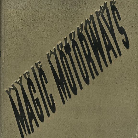
MAGIC MOTORWAYS
Norman Bel Geddes
New York: Random House, 1940. First edition. Quarto. Tan fabricoid cloth decorated in maroon. Photographically printed dust jacket. 298 pp. 206 black and white illustrations. Endpapers and gutters discolored [as usual] due to binding paper choice. Dust jacket rubbed and lightly chipped with a little bit of loss. Textblock slightly tacky to a few leaves with no sticky problems. A very good copy in a very good dust jacket: a nice copy of this legendary early treatise on the problems of modern transportation.
8.25 x 10.5 hardcover book with 298 pages and 206 black and white photographs, diagrams, illustrations and plans of the general social concepts that developed through Bel Geddes' stewardship of the FUTURAMA exhibit at the 1939 New York World's Fair. The majority of the photographs are detail shots from the Futurama exhibit by Richard Garrison.
Contents:
Highways and Horizons
Safety Comfort Speed and Economy
Eliminate the Human Factor in Driving
Separated Lanes of Traffic
Every Highway Intersection is Obsolete
Full Speed Through Bottlenecks
Daylight Standards for Night Driving
From The Atlantic to the Pacific in One Day
Eliminate Graft and Double Highway Construction
Motorway Services to Towns and Villages
Motorway Tributaries to Cities
Accelerating City Traffic One Hundred Percent
The Need for Increased Distribution
Thinking for our Grandchildren
Effects of a National Motorway System
American theatrical and industrial designer Norman Bel Geddes (United States, 1893 – 1958) was the first person to seriously apply the concepts of aerodynamics and streamlining to industrial design. To Geddes, streamlining illustrated courage: "We are too much inclined to believe, because things have long been done a certain way, that that is the best way to do them. Following old grooves of thought is one method of playing safe. But it deprives one of initiative and takes too long. It sacrifices the value of the element of surprise. At times, the only thing to do is to cut loose and do the unexpected! It takes more even than imagination to be progressive. It takes vision and courage. “
In 1927, Bel Geddes left theatrical design and began designing cars, ships, factories and railways. He rapidly created streamlined forms for objects ranging from gas-ranges to trains, in addition to a revolving restaurant and, in 1929, a 9-deck amphibian airliner that incorporated areas for deck-games, an orchestra, a fully equipped gymnasium and a solarium.
Bel Geddes designed the famous General Motors Pavilion for the 1939 New York Worlds’ Fair, which included the Highway and Horizons exhibit, more commonly known as the “Futurama.”
Bel Geddes expounded a philosophy of "essential forms" evolved from their systems of use, in his seminal book Horizons, published in 1932. He helped to establish a new professional niche -- that of "industrial designer", arguing for a closer relationship between engineering and design.
“When you drive on an interstate highway, attend a multimedia Broadway show, or watch a football game in an all-weather stadium, you owe a debt of gratitude to Norman Bel Geddes. Bel Geddes was both a visionary and a pragmatist who had a significant role in shaping not only modern America but also the nation's image of itself as leading the way into the future. Bel Geddes was a polymath who had no academic or professional training in the activities he mastered—designing stage sets, costumes, and lighting; creating theater buildings, offices, nightclubs, and houses; and authoring prescient books and articles.
"Bel Geddes believed that art, as well as architecture and design, could make people's lives psychologically and emotionally richer. He influenced the behavior of American consumers and helped make industrial and theater design into modern businesses. Believing that communication was key to shaping the modern world, Bel Geddes popularized his vision of the future through drawings, models, and photographs. Of his utopian predictions, Bel Geddes's best-known project was the Futurama exhibit in the General Motors "Highways and Horizons" pavilion at the 1939–1940 New York World's Fair. It was an immense model of America, circa 1960, seen by 27,500 visitors daily who exited with a pin proclaiming "I Have Seen the Future." -- The Harry Ransom Center
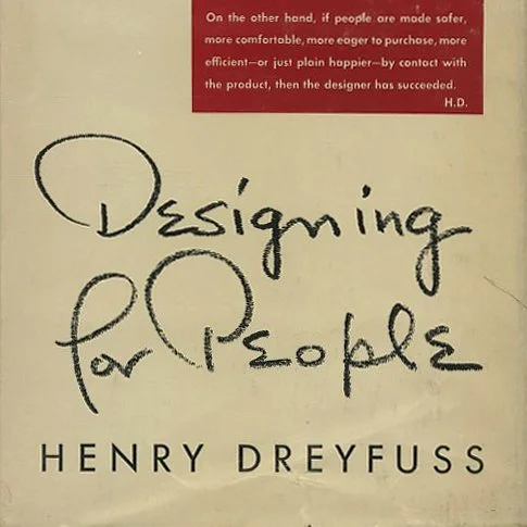
DESIGNING FOR PEOPLE
Henry Dreyfuss
NYC: Simon and Schuster, 1955. First edition. sm4to. Full brown linen titled in gilt. Printed dust jacket. Decorated endpapers. 240 pp. 32 pages of photogravure reproductions. Book design, typography and marginalian sketches throughout by the author. Jacket with trivial wear along top edge, a faint wrinkle to the lower edge, and a small stray pen mark to front panel. Bookseller ticket to rear pastedown. Remarkable well preserved—a fine copy in a nearly fine dust jacket.
7 x 9.75 hardcover book with 240 pages and 32 pages of photogravure reproductions. “A largely autobiographical retrospective view of the industrial design profession by a major protagonist in the story.” [Karpel E1110] The name Henry Dreyfuss is synonymous with industrial design. Dreyfuss was one of the "big four" industrial designers, along with Walter Dorwin Teague, Norman bel Geddes and Raymond Loewy.
US industrial designer Henry Dreyfuss (March 2, 1904 - October 5, 1972) was born in Brooklyn, NY to a family in the theatrical materials supply business. He completed studies as an apprentice to Norman Bel Geddes in 1924 and produced 250 stage sets for a number of theatres before 1928. He opened his own office in 1929 for stage and industrial design activities.
In 1929, he won a "phone of the future" competition by Bell Laboratories and began work in 1930 in collaboration with Bell staff. The result of this association was the "300" tabletop telephone, with a receiver and transmitter in a "combined handset" resting in a horizontal cradle. Molded in black phenolic plastic, it was introduced in 1937 and produced until 1950.
In 1933 he designed a new "flat-top" deluxe refrigerator introduced by General Electric, eliminating the previously exposed refrigeration unit by placing it beneath the cabinet. He also designed a new Toperator washing machine for Sears & Roebuck.
Henry was featured in a 1934 article, "Both Fish and Fowl," in Fortune magazine, written anonymously by George Nelson, which had a dramatic impact on the new field of Industrial Design. An early client was Westclox, for whom he designed an alarm clock introduced in 1935, and later their famous Big Ben alarm clock in 1939.
In 1934 he was engaged by the Hoover Company, and designed its 1936 Model 150 upright vacuum cleaner with the first plastic hood in Bakelite. His retainer fee was $25,000 per year. He designed a bottle for The American Thermos Bottle Company that appeared in 1936.
In 1936, his design of a Mercury locomotive debuted. It featured cutout holes in the "white-walled" driver wheels, lit by concealed spotlights at night. In 1938, with great fanfare, New York Central introduced 10 new streamliner steam engines and cars designed by Dreyfuss for its Twentieth Century Limited New-York-Chicago run. An upgraded version of his Mercury design, the new J 3 4-6-4 Hudson locomotives featured finned bullet-noses reminiscent of ancient warrior helmets.
In 1938 Dreyfuss's John Deere Model A tractor was introduced. Dreyfuss started working with Deere in 1937.
At the New York World's Fair in 1939, Dreyfuss designed the Democracity model in the Perisphere, representing an American city and its surrounding suburbs of the year 2039. He also designed the AT&T pavilion, featuring Vodar, an early voice synthesizer.
At the start of the war in 1941 Dreyfuss, along with Raymond Loewy and Walter Dorwin Teague were involved in the design of strategy rooms for the Joint Chiefs of Staff. Dreyfuss built four 13-foot rotating globes, one each for Roosevelt, Stalin, Churchill, and the Joint Chiefs. Commercially, he designed the best-seller Skyliner fountain pen for Eversharp.
The Society of Industrial Designers (SID) was established in 1944 by 15 practitioners, including Dreyfuss, who served as its first Vice-President. After the war in 1946, Henry hired William F. H. Purcell and Robert Hose, both of whom became partners in the firm.
In 1949 the model 500 desk telephone was put into service by AT&T. Designed by Dreyfuss, it was the first to be offered in colors other than black beginning in 1954, and was still the most commonly used model in the US in 1995.
Dreyfuss appeared on the cover of Forbes Magazine in 1951. In 1953 Minneapolis Honeywell introduced a circular wall thermostat designed by Henry. Dreyfuss began consulting with the company in 1937.
Dreyfuss published Designing for People in 1955, an autobiography that included the first publication of "Joe" and "Josephine" anthropological charts. Dreyfuss focused on design problems related to the human figure, working on problems from "the inside out", and believed that machines adapted to people would be the most efficient. The technical discipline called Human Factors was begun during the war and resulted in standards for the design of military equipment. Such data formed the basis of post-war design standards by Dreyfuss.
By 1960, The Whitney Library of Design published Measure of Man, by Dreyfuss, an ergonomic data guide compiled from military records by the Dreyfuss office. It featured Joe and Josephine and popularized the idea of fitting products to human scale. The term "ergonomics" was coined in the early 1950s to describe the new profession focused on the study of human-equipment interaction.
Although Hoover discharged Dreyfuss in 1954, in 1955 they introduced their Model 82 Constellation vacuum cleaner designed by him, a spherical shape that glided on an air cushion of its own exhaust.
In 1956 the wall-mounted telephone was re-introduced by Bell Telephone. Designed by Henry Dreyfuss Associates (HDA), it was intended as a companion to the desktop model "500." In 1958 Bell introduced his design for the first push-button telephone sets. And in 1959 Bell introduced the "Princess" phone, with hand/mouthpiece spanning the dial, and fitting compactly on the base. Its petite size was designed by HDA to appeal to teen-age girls
HDA designed a number of safety razors. The Pal stainless steel razor for American Safety Razor (1961), the Gem razor, for ASR Products Company (1965), and the Flicker, a women's rotary manual safety razor, for the American Safety Razor Company (1972).
In 1963 the Polaroid Land Company introduced its Model 100, the first to allow removal of photo to develop while shooting the next, designed by HDA. They also designed the General Motors Futurama for the 1964 World's Fair in New York, the most popular exhibit.
In 1965 The Industrial Design Society of America (IDSA) was formed by the merger of IDI, ASID and IDEA, becoming the single voice of industrial design in the US. Henry Dreyfuss was its first President. That same year, the "Trimline" telephone was introduced. Designed by Donald M. Genaro of HDA in collaboration with Western Electric staff, it combined receiver, transmitter and dial into a single element nested into a compact base.
Dreyfuss formally reorganized his office in 1967 as Henry Dreyfuss Associates, naming Donald M. Genaro, James M. Conner, and Niels Diffrient as associates. Henry retired to Pasadena, CA in 1969, but continued to serve the profession. Representing the American National Standards Institute (ANSI) in 1971, he chaired the first meeting of the International Organization of Standards Technical Committee (ISO/TC) in Berlin which set international standards for 145 signs and symbols. In 1972, McGraw-Hill published his Symbol Sourcebook: An Authoritative Guide to International Graphic Symbols.
Henry Dreyfuss died in 1972. [The Industrial Design Society of America]
![Herman Miller Furniture Company: Color Promotional Postcards [x 5]. Zeeland, MI: The Herman Miller Furniture Company [1954 – 1956].](https://images.squarespace-cdn.com/content/v1/6a074f91e54cbe1a0e669fb9/32909825-d462-4b85-9586-b26ded7dd9a0/herman_miller_postcard_set_thumb.jpg)
Color Promotional Postcards [x 5]
The Herman Miller Furniture Company
Zeeland, MI: The Herman Miller Furniture Company [1954 – 1956]. Original editions. [5] Commercial 3.5 x 6-inch postcards printed with full bleeds and four color photographic reproductions and single matched colors to versos. Unmarked but from the library of James Prestini. A fine uncirculated set.
Herman Miller Presents 4 Chairs by Charles Eames: Herman Miller produced marketing postcards featuring four of the Eames chairs in their portfolio, the plywood DCM, Wire DKR, Fiberglass PSC and RAR chairs. The front of the postcard was split into four equal sections with each showing one of the chosen chairs. The images for the card were all highly colorful, selected to provide the maximum contrast between design and interior. The rear of the card gives a short introduction to the pieces and an address section so that they can genuinely be sent by mail to friends, family or perhaps from a store to potential customers.
Chairs Designed by Charles Eames: The second of two postcards Charles and Ray Eames produced for Herman Miller in 1954 to promote their designs. Like the other example, this postcard was created to emphasize how each of the Eameses’ three furniture systems—the molded plywood, molded plastic, and upholstered wire chairs—offered “versatile solutions to contemporary seating problems.” Clockwise from the upper left, there is an upholstered fiberglass armchair with a one piece upholstery pad, or DAX-1, an upholstered PSC-1 side chair, an LCM molded plywood lounge chair with metal legs, and a DSR fiberglass side chair featuring an “Eiffel Tower” base. While the other postcard offers more colorful design configurations and backdrops, here a more reserved approach helps highlight the recently expanded offering of neutrals (as called out on the reverse). Each vignette was painstakingly constructed to best complement the individual design while also working as a unit. Travertine and rosewood tabletops (upper right, and lower left, respectively) are repurposed as backdrops while “humble materials,” such as hand-carved wooden spoons and houseplants humanize and add character to each vignette. Items such as the papier-mâché Japanese tiger toy known as Hariko-No-Tora, gourd-shaped Chinese paper lantern, and selection of antique German Springerle molds speak to the Eameses’ burgeoning international fame and interests.
The Sofa by Charles Eames: In 1954 Charles and Ray Eames introduced their first design for a sofa. Based roughly on the ergonomics and dimensions of the built-in alcove seating in the Eames House living room, the S-73 Sofa Compact was conceived as a low-cost and lightweight solution for sofas in residential and commercial applications. This promotional postcard featured the signature Eames touches such as paper kites, flower arrangements, and an abundant array of fruits, nuts, cheeses, and cigarettes atop three LTR tables, this vignette also highlights the contribution of the newly established Herman Miller Textile Division led by the Eameses’ friend and colleague Alexander Girard. Girard conceived the textile program as a flexible toolkit that included everything from more durable and prosaic woven upholstery fabrics (such as this sofa’s covering, Nubstripe) to delicate screen-printed casements (illustrated here at left by yardage of the 1953 pattern Rain).
Herman Miller Presents the Rosewood Collection by George Nelson: Herman Miller introduced the Rosewood Cabinet Series in 1956 as a luxurious upgrade from Nelson’s Basic Cabinet Series of 1946. With the Basic Cabinet Series, he created a way to accommodate changing needs for storage and surfaces. The size and purpose of a room doesn't matter. The interchangeable components allow you to create beautiful storage solutions for your big great room or your small living room. The system starts small in your small apartment and welcomes additional components if you move into larger spaces. This card notes beautiful rosewood used in the cabinet series “remarkable for its appeal to both modern and traditional tastes. many sizes, arrangements possible; the Hi-Fi units are particularly impressive. This card features a black overprint to verso — (Shown on reverse side: 5518TV Rosewood Hi-Fi television cabinet).
Herman Miller Presents the Executive Office Group by George Nelson: While the Eameses usually saw to the creation of promotional materials related to their designs, they would do so in coordination with George Nelson, who as Herman Miller’s design director was responsible for leading the company’s overall brand image and communications strategy. While this promotional postcard for George Nelson’s Executive Office Group carries no attribution, based on the contextual similarities to other Eames-designed postcards and inclusion of a colorful Eames DAT-1 swiveling and tilting desk chair, it is likely to have been staged, photographed, and designed by the Eames Office.
In a characteristically wry 1944 correspondence with Herman Miller founder, DJ De Pree, George Nelson wrote that “your reservations on my suitability as a designer for Herman Miller Co., impressed me very much for they seem to be well founded… the question of lack of experience in the commercial furniture field is also important, but here, I am afraid, you and your associates will have to make the decision on your own.” Fast forward four years later, and Nelson once again found himself reflecting on the integrity of the Herman Miller Co., but this time, not as a potential hire but rather as Herman Miller’s founding creative director.
In the 1948 introduction to the catalog for his first ever collection for the company, Nelson wrote, “From the viewpoint of the designer, which is the only viewpoint I can assume with any degree of propriety, the Herman Miller Furniture Company is a rather remarkable institution. Seen solely as a business enterprise, it is probably indistinguishable from thousands of others scattered through the U.S. It is a small company, it is located in a small town, its production facilities are adequate but not unusual, and it is run by the people who own it. What is remarkable about this enterprise is its philosophy—an attitude so deeply felt that to the best of my knowledge it has never been formulated.
“Stated in its bare essentials, this philosophy—like others that have been solidly based—is so simple that it sounds almost naïve. But it is not widely held by business, and perhaps it would be naïve if it were not so astonishingly effective. This company today occupies a very solid position as a manufacturer of modern furniture and enjoys a prestige all out of proportion to its size. The attitude that governs Herman Miller’s behavior, as far as I can make out, is compounded of the following set of principles:
“What you make is important. Herman Miller, like all other companies, is governed by the rules of the American economy, but I have yet to see quality of construction or finish skimped to meet a popular price bracket, or for any other reason. Also, while the company has materially expanded its production, the limits of this expansion will be set by the size of the market that will accept Herman Miller’s kind of furniture—the product will not be changed to expand the business.
“Design is an integral part of the business. In this company’s scheme of things, the designer’s decisions are as important as those of the sales or production departments. If the design is changed, it is with the designer’s participation and approval. There is no pressure on him to modify design to meet the market.
“The product must be honest. Herman Miller discontinued production of period reproductions almost twelve years ago because its designer, Gilbert Rohde, had convinced the management that imitation of traditional designs was insincere aesthetically. (I couldn’t believe this story when I first heard it, but after my experience of the past few years, I know it is true.)
“You decide what you will make. Herman Miller has never done any consumer research or any pre-testing of its products to determine what the market “will accept.” If designer and management like a solution to a particular furniture problem, it is put into production. There is no attempt to conform to the so-called norms of “public taste,” nor any special faith in the methods used to evaluate the “buying public.” The reason many people are struck by the freshness of Herman Miller designs is that the company is not playing follow-the-leader. Its designers are therefore not hamstrung by management’s fear of getting out of step. All that is asked of the designer is a valid solution.
“There is a market for good design. This assumption has been more than confirmed, but it took a great deal of courage to make it and stick to it. The fact is that in furniture as in many other fields, there is a substantial segment of the public that is well in advance of the manufacturers. But few producers dare to believe it.
“In this outline of an attitude, you will no doubt recognize several familiar patterns: there is a hint of the craftsman as opposed to the industrialist; there is a suggestion of the “better mousetrap” theory in another form, and the rugged individual with convictions is in evidence throughout. But if the philosophy sounds somewhat archaic, it is interesting to see its manifestations in terms of the furniture shown in this book. It is unlikely that any person would be equally enthusiastic—or unenthusiastic— about every piece shown, but I think it would be difficult not to conclude that the company had a real interest in exploiting some of the possibilities open to furniture today in the areas of design, materials and techniques. The furniture shown here is the result of a program as well as a philosophy. The program includes an assumption that plywood and lumber are only two of a whole range of materials suitable for furniture. A considerable amount of experimental design work is being done on new pieces that explore the possibilities of others. It also assumes that the program is strengthened by the participation of a group of designers who share Herman Miller’s particular attitudes. I believe that the range of the collection—from Noguchi’s sculptured table to Hvidt and Neilsen’s impeccably crafted pieces to Eames’ magnificent designs in molded wood, metal, and plastic—could never be encompassed by a single designer, for the various underlying approaches, while related, are too intensely personal. A final word on the Herman Miller program: its goal is a permanent collection designed to meet fully the requirements for modern living. The collection is to be permanent in the sense that it will not be scrapped for each market, or for each new “trend” as announced by the style experts. It is designed to grow, not necessarily in size, but in the perfection of its component parts. No piece will be kept if a better design can be developed to take its place, nor will a given way of making things be followed simply because that’s the way they were always made. Also, ways of living are continually changing. Again, I think, the material in this book suggests the attitude more clearly than any statement.
“There is one other point that may be of interest to those concerned with problems of design: by far the largest part of the collection was designed by people trained in architecture. It may be no more than a coincidence, and I must certainly confess a prejudice in this regard, but there is this to be said for the architectural approach to any design problem, and particularly that of furniture: the problem is never seen in isolation. The design process is always related on the one hand to the houses or other structures in which the furniture is to be used, and on the other to the people who will use it. When successfully followed through, the approach of the architect-in-industry goes much deeper than styling and is far more likely to create trends than to follow them. To reinforce this point it is not necessary to use only the Herman Miller program as an example. The work of Alvar Aalto, Marcel Breuer, Eero Saarinen and many others could be cited.
![RAND, PAUL. Robert Goldwater: MODERN ART IN YOUR LIFE. New York: Museum of Modern Art, 1949. First edition [MoMA Bulletin, V. 17, No. 1].](https://images.squarespace-cdn.com/content/v1/6a074f91e54cbe1a0e669fb9/54d9b80a-7c63-433b-b15a-869f9bc410e5/modern_art_in_your_life_49_thumb.jpg)
MODERN ART IN YOUR LIFE
Museum of Modern Art Bulletin, V. 17, No. 1, 1949
Robert Goldwater, Paul Rand [cover design]
New York: Museum of Modern Art, 1949. First edition [MoMA Bulletin, V. 17, No. 1, 1949]. Quarto. Printed and stapled wrappers. 48 pp. 143 black and white photographs. Paul Rand’s cover design is widely recognized as one of his most iconic. Uncoated wrappers lightly age-toned, as usual for this edition. Blank rear panel with a couple of tiny spots, and covered with a faint wood grain discoloration from storage on a nicely textured plank. This shadow actually is pretty great and adds a suitable extra dimension to this very good copy.
7.25 x 9.25 softcover book with 48 pages and 143 black-and-white photographs and illustrations of how modern art had infiltrated everyday life in postwar America. All aspects of modern culture are represented: architecture, furniture, fabrics, ceramics, textiles, books, posters, exhibits, sculpture, graphic design, etc. This slim volume is extraordinarily comprehensive.
As usual, Rand nailed the concept of this book with a perfect visual image. Highly recommended.
The catalog to the exhibition states in its foreword: "'Modern Art in Your Life' ... is the second exhibition presented by the Museum of Modern Art to celebrate its 20th Anniversary. The first, 'Timeless Aspects of Modern Art,' dealt with the relationship between modern art and the art of past periods, and was designed to show that modern art is not an isolated phenomenon in history but an integral part of the art of all ages, "'Modern Art in Your Life' is designed to show that the appearance and shape of countless objects of our everyday environment are related to, or derived from, modern painting and sculpture, and that modern art is an intinsic part of modern living. "These exhibitions are not presented as a justification of the artistic merit of modern art. Works of art need no justification beyond their own appeal. The aim of this special series is to demonstrate, persistent doubters to the contrary, that modern art, like the art of any period, is both rooted in tradition and truly pertinent to its own time.”
Artisans whose work is featured in this volume include Piet Mondrian, George Nelson, Jean Lurcat, Theo van Doesburg, Naum Gabo, El Lissitzky, Kasimir Malevich,Ben Nicholson, Marcel Breuer, Paul Doering, Walter Gropius, Otto Haesler, Raymond Hood, George Howe and William Lescaze, Mies van der Rohe, Gerrit Rietveld, Antonin Raymond, Anni Albers, Charles Eames,Eero Saarinen, Harry Weese, Ben Baldwin, A. M. Cassandre, Tonio del Renzio, Laszlo Moholy-Nagy, Erik Nitsche, Stamo Papadaki, Alexander Archipenko, Fernand leger, Amedee Ozenfant, John Vassos, Jean Carlu, E. McKnight Kauffer, JeanArp, alexander Calder, Joan Miro, Isamu Noguchi, Oscar Niemeyer, Ben Rose, Alvin Lustig, Paul Klee, Henry Moore, Pablo Picasso, Alexander Girard, Lester Beall, Ben Shahn, Salvador Dali, Max Ernst, Rene Magritte, Yves Tanguy and many others.
The Museum of Modern Art’s first press release describes this show thus: “Modern Art in Your Life,” an exhibition to show how modern art is a source and catalyst for much of our daily environment from 5th Avenue windows to newspaper advertisements, will occupy the entire 3rd floor of the Museum of Modern Art, 11 West 53 Street, from October 5 to December II. The exhibition, relating "applied" art to the "pure" art which is frequently its source, will commemorate the founding of the Museum in 1929* This 20th Anniversary Exhibition is being organized by Rene d’Harnoncourt, Director of the Museum's Curatorial Departments, in collaboration with Robert Goldwater. author, Associate Professor of Art History at Queens College and Editor of the Magazine of Art.
Buildings, furniture, useful objects, shop displays and advertisements that are accepted readily and enjoyed by the public are related to or derived from works of art frequently considered meaningless and even ugly. The exhibition will show how the appearance of a popular magazine or of a box of cleaning tissue has direct antecedents in the most elusive abstract art. The architect eliminating ornament, the jacket designer basing his appeal on square-cut letters and balanced rectangles share the artist Mondrian1s delight in the severe beauty of mathematical order. The furniture designer bends his plywood into freely molded shapes that have their counterparts in works by Arp and Miro.
Although the exhibition does not cover every style and every school of modern art and its widespread influences, examples are selected on a basis sufficiently broad to indicate the great variety of modern art and the broad scope of its effect on modern living. Sections consisting of a number of paintings and sculptures and a number of objects related to them will be devoted to abstraction, to various forms of stylization and to surrealism and fantastic art. The Museum feels that this educational exhibition associating pure and applied art - without minimizing the independent existence of either - may help to make modern art more comprehensible to more people.
The second, descriptive press release describes the arrangements within the galleries: “Nearing the end of the exhibition the visitor returns to the pure white wall and to abstract art, but again, as in the preceding section, using organic instead of geometric form. These forms are represented by the work of Arp, Calder, Miro and Noguchi. Their counterparts in design and architecture are illustrated in the room beyond. The far wall is a light blue suggestive of space, and suspended before it is a large chart of silhouetted furniture forms designed by George Nelson for the magazine Interiors, Below are examples of furniture from which these forms were taken and which are closely related to the art in the main gallery. The molded plywood chair designed by Eames; the "hammock" chair by Bonet, Kurchan and Hardoy are among the pieces shown. Pottery, textiles, advertising and package design emphasize once again how much a part of our lives these shapes have become.”
If the word legend has any meaning in the graphic arts and if the term legendary can be applied with accuracy to the career of any designer, it can certainly be applied to Paul Rand (1914-1996). By 1947, the legend was already firmly in place. By then Paul had completed his first career as a designer of media promotion at Esquire-Coronet --and as an outstanding cover designer for Apparel Arts and Directions. He was well along on a second career as an advertising designer at the William Weintraub agency which he had joined as art director at its founding. THOUGHTS ON DESIGN (with reproductions of almost one hundred of his designs and some of the best words yet written on graphic design) had just published -- an event that cemented his international reputation and identified him as a designer of influence from Zurich to Tokyo.
A chronology of Rand's design experience has paralleled the development of the modern design movement. Paul Rand’s first career in media promotion and cover design ran from 1937 to 1941, his second career in advertising design ran from 1941 to 1954, and his third career in corporate identification began in 1954. Paralleling these three careers there has been a consuming interest in design education and Paul Rand's fourth career as an educator started at Cooper Union in 1942. He taught at Pratt Institute in 1946 and in 1956 he accepted a post at Yale University's graduate school of design where he held the title of Professor of Graphic Design.
In 1937 Rand launched his first career at Esquire. Although he was only occasionally involved in the editorial layout of that magazine, he designed material on its behalf and turned out a spectacular series of covers for Apparel Arts, a quarterly published in conjunction with Esquire. In spite of a schedule that paid no heed to regular working hours or minimum wage scales, he managed in these crucial years to find time to design an impressive array of covers for other magazines, particularly Directions. From 1938 on his work was a regular feature of the exhibitions of the Art Directors Club.
Most contemporary designers are aware of Paul Rand's successful and compelling contributions to advertising design. What is not well known is the significant role he played in setting the pattern for future approaches to the advertising concept. Rand was probably the first of a long and distinguished line of art directors to work with and appreciate the unique talent of William Bernbach. Rand described his first meeting with Bernbach as "akin to Columbus discovering America," and went on to say, "This was my first encounter with a copywriter who understood visual ideas and who didn't come in with a yellow copy pad and a preconceived notion of what the layout should look like."
Rand spent fourteen years in advertising where he demonstrated the importance of the art director in advertising and helped break the isolation that once surrounded the art department. The final thought from THOUGHTS ON DESIGN is worth repeating: "Even if it is true that commonplace advertising and exhibitions of bad taste are indicative of the mental capacity of the man in the street, the opposing argument is equally valid. Bromidic advertising catering to that bad taste merely perpetuates that mediocrity and denies him one of the most easily accessible means of aesthetic development."
In 1954 when Paul Rand decided Madison Avenue was no longer a two-way street and he resigned from the Weintraub agency, he was cited as one of the ten best art directors by the Museum of Modern Art. The rest is design history.
Laszlo Moholy-Nagy, a pioneer typographer, photographer, and designer of the modern movement and a master at the Bauhaus in Weimar, may have come closest to defining the Rand style when he said Paul was "an idealist and a realist using the language of the poet and the businessman. He thinks in terms of need and function. He is able to analyze his problems, but his fantasy is boundless."
![SUTNAR. Noel Martin [Designer]: LADISLAV SUTNAR [poster title]. Cincinnati: Contemporary Arts Center, 1961.](https://images.squarespace-cdn.com/content/v1/6a074f91e54cbe1a0e669fb9/982403e5-415b-4a7a-86ea-cf226e9ce0fd/noel_martin_sutnar_poster_1961_thumb.jpg)
LADISLAV SUTNAR
Noel Martin [Designer]
Cincinnati: Contemporary Arts Center, 1961. Original edition. Poster machine folded in quarters for mailing [as issued]. Printed in three colors on recto only. Expected wear to the heavily inked folds, and raking light reveals minor handling creases, but a very good or better example of this rare poster.
18 x 24-inch (45.7 x 61 cm) poster designed by Noel Martin for “A comprehensive exhibition of the International pioneer graphic designer, Ladislav Sutnar, sponsored by The Champion Paper and Fibre Company at the Contemporary Arts Center located in the Cincinnati Art Museum from April 7 through May 7, 1961.” After the Cincinnati debut, this exhibition was travelled to New York City and was held at the Pepsi-Cola Exhibition Gallery, 500 Park Avenue, New York City, from August 2 to 30, 1961 [Janakova et al.: LADISLAV SUTNAR - PRAGUE - NEW YORK - DESIGN IN ACTION. Prague: Museum of Decorative Arts, 2003. p. 378].
From the catalog: “The lack of discipline in our present day urban industrial environment has produced a visual condition, characterised by clutter, confusion and chaos,’ wrote Allon Schoener, the curator of the ‘Ladislav Sutnar; Visual design in Action’ exhibition originated at the Contemporary Arts Centre in Cincinnati, Ohio in 1961. ‘As a result the average man of today must struggle to accomplish such basic objectives as being able to read signs, to identify products, to digest advertisements, or to locate information in newspapers... There is an urgent need for communication based upon precision and clarity. This is the area in which Ladislav Sutnar excels.”
Mildred Constantine added: " There is a force and meaningful consistency in Sutnar's entire body of work, which permits him to express himself with a rich diversity in exhibition design and the broad variations of graphic design. Sutnar has the assured stature of th integrated designer."
Steven Heller provides this background history: "Sutnar's client base was eroding by the early 1960s. He lost his job with Sweet's because the systems in place obviated the need for a full-time art director and information research department. At a particularly difficult time, Sutnar's friends banded together to inform the business community about his work. The result was the traveling exhibition Ladislav Sutnar: Visual Design in Action, which was curated by Allon Schoener but meticulously designed by Sutnar himself.
"The exhibition was the basis for the book of the same name, which, because he could not find a publisher who would pay the high production costs, Sutnar financed out of his own pocket and sold for the hefty price of $15. Sutnar had previously edited Design for Point of Sale (1952) and Package Design (1953), which showcased exemplary work by others, but Visual Design in Action featured his own work as a model on which to base contemporary design. Sales were not very brisk, although today the book is a rare treasure."
Noel Martin (American, 1922 – 2009) was a renown self-taught typographer and designer who studied drawing, painting, and printmaking at the Art Academy of Cincinnati. He later became an instructor there and was the long-time designer for the Cincinnati Art Museum, as well as a prolific free-lance designer. Martin was celebrated for modernizing museum graphics and industrial trade catalogs. In 1953, he was featured in MoMA's landmark design exhibition, Four American Designers, along with Herbert Bayer, Leo Lionni, and Ben Shahn. His spiral-bound self-promotional piece, Identity Programs, presents some of his iconic minimalist logos.
From Steven Heller's New York Times Obituary [February 27, 2009]: " With the ubiquitous branding and expert merchandizing of museums today, it is easy to forget that graphic design was once a low priority for them. In 1947, when Mr. Martin became the Cincinnati Art Museum's first graphic designer, most museum publications were staid and musty.
"Mr. Martin maintained that contemporary typographic design, as practiced by the European Modernists, would enhance these documents and make art, particularly abstract art, more accessible and more appealing to younger museumgoers. He introduced a distinct blend of classical and modern typography to the museum's exhibition catalogs.
"Allon Schoener, a freelance museum curator and friend, said that Mr. Martin, first at the Cincinnati Art Museum and later at the Cincinnati Contemporary Arts Center, "created a style which has been emulated by most other American museums during the last 40 years."
Noel Martin was born on April 19, 1922, in Syracuse, Ohio. When he was a child, his family moved to Cincinnati, where he spent the remainder of his life. He studied painting, drawing and print- making at the Art Academy of Cincinnati in 1939-1941 and 1945-1947, between which he married his wife, Coletta, and served in the military. During World War II he served in a camouflage unit in the Army Air Force, where he made catalogs and brochures. While making educational film strips for the Army in New York he was exposed to modern art for the first time, which later influenced his work. He trained himself in the art of typography and graphic design. He became a designer for the Cincinnati Art Museum in 1947 and in 1949 began offering his services as a free-lance designer and art director to a variety of firms.
In 1951 he began teaching design and commercial art at the Art Academy of Cincinnati and worked there until 1957. In 1953 he was one of four designers featured in the Four American Designers exhibit at the Museum of Modern Art in New York, by which time he'd already become nationally known. He received the Art Director's Medal in Philadelphia in 1957.
In 1958 he redesigned The New Republic from cover to cover. Martin (1959) said, "Good typography for magazines is generally typography which is free of animation and the necessary tricks of advertising, and is functional1." He used typeface Palatino and uncluttered the cover, making sure to leave white space throughout the publication. In 1959, he wrote several articles on the relationship between modern art and graphic design.
He continued designing for the Cincinnati Art Museum throughout his life. He designed numerous booklets, books, calendars, catalogs, corporate logos, flyers, magazines, newsletters, stationary and posters throughout the following decades. Some of the firms and institutions he designed for on a free-lance basis include Champion Paper Company, Cincinnati Symphony Orchestra, Federated Department Stores, General Electric, LeBlond Ltd., Standard Oil Company, The United Fine Arts Fund, University of Cincinnati, and Xomox Corporation. He also designed corporate logos for institutions, such as Advance Mortgage Corporation, the Contemporary Arts Center, and Black Clawson, most of which were minimalist in nature.
He was featured in various editions of Who's Who in America, Who's Who in Graphic Art and Who's Who in Advertising. He was featured in numerous exhibits locally, nationally, and internationally. He wrote several articles and gave numerous lectures throughout his career. He dies of leukemia on February 23, 2009.
Ladislav Sutnar (Czechoslovakian, 1897 – 1976) arrived in the United States on April 14th, 1939 as the exhibition designer in charge of the Czechoslovakian pavilion at the New York World’s Fair. Sutnar was the Director of the State School of Graphic Arts in Prague and enjoyed a reputation as one of the leading Czech proponents of Functionalist graphic and industrial design.
Unfortunately for Sutnar’s American assignment, Czechoslovakia had ceased to exist the previous month. Germany invaded Czechoslovakia on March 15, 1939, and divided the country into the Protectorate of Bohemia and Moravia and the puppet Slovak State. The dissolution of Czechoslovakia and the outbreak of World War II stranded Sutnar in New York City where he remained and worked for the rest of his life.
By 1939 many former Bauhaus faculty members—Marcel Breuer, Walter Gropius, Mies van der Rohe, László Moholy-Nagy, Joseph Albers, and others—had won teaching positions at various American Universities. These educators were instrumental in bringing European modernism to American architecture and design. America offered the Europeans not only a safe haven, but also great opportunities to make their modernist visions reality. The dynamically developing US building industry and the open mass-production market permitted the exiled Avant-Garde to continue pursuing their ideas in a democratically minded society.
It was in this exile community that Paul Rand introduced Sutnar to Knud Lönberg-Holm, the director of Information Research for Sweet’s Catalog Service, the mediator for trade, construction and hardware catalogs that were collected in huge binders and distributed to businesses and architects throughout the United States.
In 1941 Lönberg-Holm appointed Sutnar as chief designer of the Information Research Division. Together the two men used modern functional principles to solve the contemporary problem of information organization and —most importantly—retrieval. During the next 20 years at Sweet’s Sutnar and Lönberg-Holm defined and pioneered the field now called information design.
![Sutnar and Lönberg-Holm: CATALOG DESIGN PROGRESS: Advancing Standards In Visual Communication. New York: Sweet’s Catalog Service, [F. W. Dodge Corporation] 1950.](https://images.squarespace-cdn.com/content/v1/6a074f91e54cbe1a0e669fb9/613f1ac3-2ca1-4e43-999f-c2dc4b3fd9cc/sutnar_catalog_design_1950_thumb.jpg)
CATALOG DESIGN PROGRESS
Advancing Standards In Visual Communication
K[nud]. Lönberg-Holm and Ladislav Sutnar
New York: Sweet’s Catalog Service, [F. W. Dodge Corporation] 1950. First edition [less than 1,000 copies printed]. Oblong quarto. Five-color screen-printed glazed paper boards. Screen-printed plastic coil-binding. Unpaginated [106 pp.] Yellow acetate frontis. Four title pages printed in color on heavier stock. Multiple paper stocks and printing techniques with elaborate graphic design throughout by Ladislav Sutnar. Plastic coil-binding in very good condition, with the upper tooth cleanly split. Boards lightly soiled with trivial wear to binding edges, as usual. A well-preserved copy of this legendary volume and much nicer than usually found — a very good or better copy.
9.5 x 12.5 hardcover book with approximately 106 illustrated pages that simply must be seen to be believed. This book was printed on a variety of papers (coated, uncoated, textured, etc.) with a stiff plastic front free endpaper and a screen-printed label on the plastic binding. The overall effect is truly amazing.
Sutnar and Lönberg-Holm’s format contributions were “just as dramatic a change from previous product information presentation as was the introduction of the International Style in architecture.” — Joseph V. Bower, Sweet’s National Marketing Manager, 1984
Ladislav Sutnar (1897 – 1976) arrived in the United States on April 14th, 1939 as the exhibition designer in charge of the Czechoslovakian pavilion at the New York World’s Fair. Sutnar was the Director of the State School of Graphic Arts in Prague and enjoyed a reputation as one of the leading Czech proponents of Functionalist graphic and industrial design.
Unfortunately for Sutnar’s American assignment, Czechoslovakia had ceased to exist the previous month. Germany invaded Czechoslovakia on March 15, 1939, and divided the country into the Protectorate of Bohemia and Moravia and the puppet Slovak State. The dissolution of Czechoslovakia and the outbreak of World War II stranded Sutnar in New York City where he remained and worked for the rest of his life.
By 1939 many former Bauhaus faculty members—Marcel Breuer, Walter Gropius, Mies van der Rohe, László Moholy-Nagy, Joseph Albers, and others—had won teaching positions at various American Universities. These educators were instrumental in bringing European modernism to American architecture and design. America offered the Europeans not only a safe haven, but also great opportunities to make their modernist visions reality. The dynamically developing US building industry and the open mass-production market permitted the exiled Avant-Garde to continue pursuing their ideas in a democratically minded society.
It was in this exile community that Paul Rand introduced Sutnar to Knud Lönberg-Holm, the director of Information Research for Sweet’s Catalog Service, the mediator for trade, construction and hardware catalogs that were collected in huge binders and distributed to businesses and architects throughout the United States.
In 1941 Lönberg-Holm appointed Sutnar as chief designer of the Information Research Division. Together the two men used modern functional principles to solve the contemporary problem of information organization and —most importantly—retrieval. During the next 20 years at Sweet’s Sutnar and Lönberg-Holm defined and pioneered the field now called information design.
Sweet’s Catalog Service (established in 1906) was an information clearing house, evaluating hundreds of catalogs of individual manufacturers with the aim of making the resulting information searachable in an optimal way. Information organization was the central issue, and optimizing it through visual means was an important element in the enterprise, hence the need for a competent art director.
U. S. industrial catalog production in the early 1940s was not in tune with the faster rhythms of the modern tempo. According to an undated internal Sweet’s memorandum “ . . . an industrial catalog is far from an inspiring project, we picture it as cumbersome, colorless, indifferently-printed item of necessity nothing [other] than dreary inventory . . .”
Major flaws included a proliferation of long descriptive texts and mediocre layout, as the manufacturers usually commissioned their catalog production to local printers who simply followed their every whim. The need for informative, relevant and quick-to-read advertising, common in Europe for more than a decade, appeared in the U. S. only with the heightened tempo of production due to the war effort.
During their tenure at Sweet’s from 1944 and 1950 Sutnar and Lönberg-Holm wrote and designed three publications on information design, delivering the most definitive explanation of their mission and in turn they succeeded in revolutionizing the field of information design.
Catalog Design [1944] introduced the basic concepts in catalog design. Designing Information [1947] applied the basic concepts of information design to a broader range, and Catalog Design Progress [1950] further developed ideas in visual communication. All three books demonstrate the very thesis they had worked to develop at Sweet’s — information that is easier to read is easier to comprehend.
“This study of catalog design describes the development of new information patterns through a technique based on analytically determined standards. Its structure follows the procedure of this technique involving: 1) analysis of the design problem, setting up new standards for function, content, and format; 2) the development of standard design elements; 3) the integration of these elements into new design patterns.” — Lönberg-Holm and Sutnar
According to Steven Heller: "Over forty years after its publication, CATALOG DESIGN PROGRESS remains the archetype for functional design. It is a textbook for how designers can organize and prioritize information in a digital environment . . . "
". . . Ladislav Sutnar was a progenitor of the current practice of information graphics, the lighter of a torch that is carried today by Edward Tufte and Richard Saul Wurman, among others. For a wide range of American businesses, Sutnar developed graphic systems that clarified vast amounts of complex information, transforming business data into digestible units. He was the man responsible for putting the parentheses around American telephone area-code numbers when they were first introduced."
"As impersonal as the area-code design might appear, the parentheses were actually among Sutnar's signature devices, one of many he used to distinguish and highlight information. As the art director, from 1941 to 1960, of F.W. Dodge's Sweet's Catalog Service, America's leading distributor and producer of trade and manufacturing catalogues, Sutnar developed various typographic and iconographic navigational devices that allowed users to efficiently traverse seas of data. His icons are analogous to the friendly computer symbols used today."
"He made Constructivism playful and used geometry to create the dynamics of organization," says Noel Martin, who was a member of Sutnar's small circle of friends in the late 1950s."
"One of his favorite comments was: "Without efficient typography, the jet plane pilot cannot read his instrument panel fast enough to survive. [So] new means had to come to meet the quickening tempo of industry. Graphic design was forced to develop higher standards of performance to speed up the transmission of information. [And] the watchword of today is 'faster, faster'; produce faster, distribute faster, communicate faster." excerpt ©2004 AIGA
A true high point of American Graphic Design.
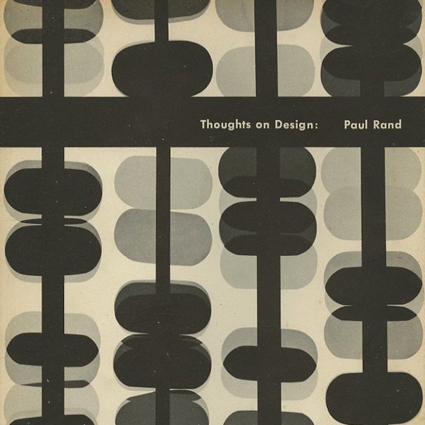
THOUGHTS ON DESIGN
An Inscribed Copy
Paul Rand; E. McKnight Kauffer [introduction]
New York: Wittenborn, 1951. Second edition. Quarto. Trilingual edition, with French and Spanish translations. Black cloth decorated in gilt. Photographically printed dust jacket. 164 pp. 94 halftone illustrations and 8 color plates. The price clipped dust jacket is lightly tanned to spine [as usual] with a couple of very tiny chips, and a closed tear to rear panel expertly repaired with tape to verso. Jacket also is a quarter-inch shorter than a comparable fiirst edition jacket [?]. A very desirable title -- please refer to page 217 of Steven Heller mononograph PAUL RAND [Phaidon 1999] to view the usual condition when this book is normally found. A nearly fine copy in a nearly fine dust jacket. Rare thus.
Inscribed by Rand on front free endpaper: " for Doug / Paul Rand / 11.25.80" directly below the former owners inked “[name] / Yale School of Art / November 1980.” Former owner was a student of Rands’ at Yale in the eighties.
8.5 x 10.75 hardcover book with 164 pages, 94 halftone illustrations and 8 color plates. Trilingual edition, with French and Spanish translations. From the dust jacket: "Rand is aware of the complexity of the designer's function: he stresses this again and again. He has no patience with slickness, with facility; he is a severe critic of the hackneyed and the insincere. All this is dead wood to be cleared away."
If the word legend has any meaning in the graphic arts and if the term legendary can be applied with accuracy to the career of any designer, it can certainly be applied to Paul Rand (1914-1996). By 1947, the legend was already firmly in place. By then Paul had completed his first career as a designer of media promotion at Esquire-Coronet --and as an outstanding cover designer for Apparel Arts and Directions. He was well along on a second career as an advertising designer at the William Weintraub agency which he had joined as art director at its founding. THOUGHTS ON DESIGN (with reproductions of almost one hundred of his designs and some of the best words yet written on graphic design) had just published -- an event that cemented his international reputation and identified him as a designer of influence from Zurich to Tokyo.
A chronology of Rand's design experience has paralleled the development of the modern design movement. Paul Rand’s first career in media promotion and cover design ran from 1937 to 1941, his second career in advertising design ran from 1941 to 1954, and his third career in corporate identification began in 1954. Paralleling these three careers there has been a consuming interest in design education and Paul Rand's fourth career as an educator started at Cooper Union in 1942. He taught at Pratt Institute in 1946 and in 1956 he accepted a post at Yale University's graduate school of design where he held the title of Professor of Graphic Design.
In 1937 Rand launched his first career at Esquire. Although he was only occasionally involved in the editorial layout of that magazine, he designed material on its behalf and turned out a spectacular series of covers for Apparel Arts, a quarterly published in conjunction with Esquire. In spite of a schedule that paid no heed to regular working hours or minimum wage scales, he managed in these crucial years to find time to design an impressive array of covers for other magazines, particularly Directions. From 1938 on his work was a regular feature of the exhibitions of the Art Directors Club.
Most contemporary designers are aware of Paul Rand's successful and compelling contributions to advertising design. What is not well known is the significant role he played in setting the pattern for future approaches to the advertising concept. Rand was probably the first of a long and distinguished line of art directors to work with and appreciate the unique talent of William Bernbach. Rand described his first meeting with Bernbach as "akin to Columbus discovering America," and went on to say, "This was my first encounter with a copywriter who understood visual ideas and who didn't come in with a yellow copy pad and a preconceived notion of what the layout should look like."
Rand spent fourteen years in advertising where he demonstrated the importance of the art director in advertising and helped break the isolation that once surrounded the art department. The final thought from THOUGHTS ON DESIGN is worth repeating: "Even if it is true that commonplace advertising and exhibitions of bad taste are indicative of the mental capacity of the man in the street, the opposing argument is equally valid. Bromidic advertising catering to that bad taste merely perpetuates that mediocrity and denies him one of the most easily accessible means of aesthetic development."
In 1954 when Paul Rand decided Madison Avenue was no longer a two-way street and he resigned from the Weintraub agency, he was cited as one of the ten best art directors by the Museum of Modern Art. The rest is design history.
László Moholy-Nagy, a pioneer typographer, photographer, and designer of the modern movement and a master at the Bauhaus in Weimar, may have come closest to defining the Rand style when he said Paul was "an idealist and a realist using the language of the poet and the businessman. He thinks in terms of need and function. He is able to analyze his problems, but his fantasy is boundless."
![Blake, John E. [Editor]: A MANAGEMENT GUIDE TO CORPORATE IDENTITY. London: Council of Industrial Design, 1971.](https://images.squarespace-cdn.com/content/v1/6a074f91e54cbe1a0e669fb9/0306185a-1619-40de-95dc-bcd87a316bdc/management_guide_to_cororate_identity_1971_thumb.jpg)
A MANAGEMENT GUIDE TO CORPORATE IDENTITY
John E. Blake [Editor], F. H. K. Henrion [Contributor]
London: Council of Industrial Design, 1971. First edition. Slim quarto. Glossy perfect-bound printed wrappers. 100 pp. Fully illustrated in color and black and white. Glossy wrappers lightly soiled, otherwise a fine copy. An uncommon title.
7 x 8.5-inch perfect-bound book with 100 pages of illustrated examples of tightly executed Corporate Design programs. Includes “How Designers Serve Corporate Needs” by F. H. K. Henrion.
“Companies with a high degree of sophistication in their approach to management in general not only have the least difficulty in carrying through a corporate identity programme but also succeed in deriving the most benefit from it.
“This is one of the conclusions of this book which looks at corporate identity as a management tool. It goes on to suggest that industry requires a new type of consultancy to serve all aspects of corporate communications. 'Such a service would combine design with public relations, advertising, sales, communications and marketing generally, so that design would occupy its proper place within the communications mix.
“The book is intended for all levels of management, for designers, PR and advertising executives and marketing specialists. It provides a guide to the systematic analysis of the diverse tasks and procedures involved in any corporate identity programme. It examines the use of opinion research, the role of the designer and the cost and benefits of designing and applying a programme. All this is supplemented by nine case studies which illustrate practical solutions within a wide range of companies.” [Preface]

SIGNS + SYMBOLS
Erhardt D. Stiebner, Dieter Urban
New York: Van Nostrand Reinhold, 1984. First English-language Edition [originally published in Germany as Zeichen + Signets]. Quarto. Textured printed wrappers. 357 pp. 2,000+ black and white examples. Wrappers lightly handled but a nearly fine copy.
6 x 9-inch softcover book with 357 pages and over 2,000 black and white examples from 38 countries. Compact little conspectus chock full of the best work from around the world, circa 1982. Dedicated sections to Symbols, Emblems and Signals; Basic Forms; Trademarks; Standardized Signs; Pictographs; Orientation Systems and more.
Includes work by Paul Rand, Louis Danziger, Herbert Leupin, Yusaku Kamekura (many examples), Morton Goldsholl, Ladislav Sutnar, Joseph Binder, Hans Schleger, Hiroshi Ohchi, Hans Hartmann, Alvin Lustig, Carlo Vivarelli, Jupp Ernst, Walter Herdeg, Honneger-Lavater, Meier Menzel, Charles Dean, Bruno Munari, Jacques Nathan, Max Koerner, Pierre Gauchat, Donald Brun, Albert Ruegg, F. H. K. Henrion, Anton Stankowski, Jean Colin, Jean Picart Le Doux, Lucien Bernhard, Hans Neuburg, Studio Boggeri, Andre Masson, Walter Diethelm, Ashley Havinden, George Tscherny, Kenji Ito, Herbert Bayer, George Nelson, Max Huber, Sori Yanagi, Herbert Spencer, Celestino Piatti, Taylor Poore, Isamu Noguchi, Milner Gray, David Stone Martin, Albe Steiner, Raymond Loewy Associates, Jan Tschichold, George Salter, Ernst Keller, Paul Klee, Herbert Matter, Leo Lionni, Marcello Nizzoli, Heinz Waibl, Karl Gerstner, Saul Bass, and hundreds of other graphic designers from around the globe.
![Kaufmann, Edgar Jr.: FIFTY YEARS OF DANISH SILVER IN THE GEORG JENSEN TRADITION. Copenhagen: Dyva & Jepersens Bogyrykkeri A/S [for the Museum of Modern Art, 1954].](https://images.squarespace-cdn.com/content/v1/6a074f91e54cbe1a0e669fb9/1aeefcd4-5457-4eae-a830-17daaeb1a016/fifty_years_danish_silver_1954_thumb.jpg)
FIFTY YEARS OF DANISH SILVER IN THE GEORG JENSEN TRADITION
Edgar Kaufmann Jr. [introduction], Keld Helmer-Petersen [Photographer], Finn Juhl [Designer]
Copenhagen: Dyva & Jepersens Bogyrykkeri A/S [for the Museum of Modern Art, 1954]. First edition. Square quarto. Photo illustrated sewn and perfect bound wrappers. 72 pp. Fully illustrated with examples of Georg Jensen silver photographed by Keld Helmer-Petersen and Erik Hansen. Book design by Finn Juhl. Upper corner bruised with some creasing to interior pages. Spine heel faintly stained, but a very good copy of this elegant catlaog.
7.85 - 7.85-inch catalog with 72 pages of introductory essays and beautiful photography of Georg Jensen silver designs. Editor Edgar Kaufmann, Jr. contributed the introduction, with additional essays by Erik Lassen, and Chr. Ditlev Reventlow. Photography by Keld Helmer-Petersen and Erik Hansen illustrates how the company transitioned from organic Art Nouveau designs to streamlined, modern Scandinavian forms, with sensitive layout and design by Finn Juhl.
The primary designers whose works define the 50-year retrospective include: Georg Jensen (1866–1935): The founder, whose sculptural backgrounds and romance with nature established the signature look: hand-hammered surfaces, organic ornamentation, blossoms, and heavy grape motifs.
Johan Rohde (1856–1935): A painter and architect whose cautious, methodical discipline perfectly balanced Jensen's spontaneous style. Rohde designed the world-famous "Acorn" flatware pattern (1915) and contributed structured, minimalist hollowware that anticipated modernism.
Harald Nielsen (1892–1977): Jensen’s brother-in-law who started as an apprentice and rose to become chief designer after Jensen's death. He steered the company away from elaborate flora toward austere, geometric lines, most famously captured in his "Pyramid" flatware pattern (1926) and the "Old Danish" pattern.
Gundorph Albertus (1887–1970): A sculptor who infused a stylized, architectural feel into the catalog, renowned for designing the structural "Cactus" pattern in 1930.
Sigvard Bernadotte (1907–2002): A Swedish prince whose collaboration injected a sharp, avant-garde Swedish functionalism. His pieces in the book are celebrated for their tight fluting and perfect cylindrical symmetry.
Henning Koppel (1918–1981): Representing the final, most modern chapter captured in the 1954 collection. Koppel completely threw out past conventions to craft smooth, abstract, biomorphic hollowware—resembling liquid metal sculptures rather than traditional tableware.
The 1954 publication dates dates this catalog to the same year as the landmark Design in Scandinavia exhibition organized by the four Scandinavian countries, Denmark, Sweden, Norway and Finland; this monumental exhibition proved to be the most important marketing effort ever for Scandinavian design. From 1954 to 1963 Design in Scandinavia toured the United States and Canada. The exhibition was presented in 27 cities, and it was a huge success, initiated by The Danish Society of Arts and Crafts and its sister organizations in the other participating countries.
Based on the success the four countries established what they called the Scandinavian Design Cavalcade, which had a lot of US press coverage as well. In that connection the July 1963 issue of House Beautiful was centered around The Scandinavian Look in U.S. Homes, and it was Denmark and Danish Design in particular that the magazine focussed on. Besides the editorial pages, the numerous ads illustrates that Danish modern furniture was increasingly gaining a stronghold among certain groups of American consumers.
Importers and retail chains like John Stuart Inc., George Tanier, Raymor and Dunbar etc. now sold Danish modern furniture in the US, and by now it was not only hand crafted furniture from the Copenhagen Cabinetmakers’ Guild Exhibitions but also pieces from industrial furniture producers like Fritz Hansen, Søborg Møbelfabrik, Fredericia Furniture and many others. From the end of the 1950s Danish Department stores and other retailers produced comprehensive brochures and booklets in English with prices in US Dollars presenting Danish Design to American and other tourists.
Without exception, these stores all presented the narrative of Danish modern. “Denmark is known all over the world for its exquisite home furnishing, which are characterized by their outstanding design and superb craftsmanship” the department store Magasin claimed in its brochure “Danish Design.”
Edgar Kaufmann Jr. [1910–1989] studied painting and typography in Europe before serving as an apprentice architect at Frank Lloyd Wright’s Taliesin Foundation from 1933 to 1934. The Kaufmanns of Pittsburgh commissioned two of the iconic American residences of the 20th-century, Wright’s Fallingwater in 1936 and then Richard Neutra’s Palm Springs Desert House in 1946. Edgar Jr. joined the Museum of Modern Art in 1946 as director of the Industrial Design Department, a position he held until 1955. While at MoMA, he initiated the Good Design program [1950 - 1955] and was a strong proponent of uniform industrial design education standards.

DESIGN 5 + 6: 1989
Jens Bersen [Editor]
København: Dansk Design Center, 1989. First edition. Parallel text in Danish and English. Slim square quarto. Printed perfect bound wrappers. 71 pp. Black and white photo illustrations and diagrams throughout. Cover design by Hans J. Wegner. A fine copy.
8.25 x 7.85 softcover periodical from the Dansk Design Center book with 71 pages devoted to case studies of 32 different Wegner chair designs from 1944 to 1986. Wegner will always be remembered for these contributions to Danish design: he was a master carpenter first and a designer second, with perfectly finished joints and exquisite forms. He showed a deep respect for the wood and its character and an everlasting curiosity about good materials. He gave minimalism an organic and natural softness. He is considered as “the master chair-maker” and designed more than 500 chairs during the course of his life.
Contents:
A Bridge in design-Land, Denmark: Jens Bersen
Front Matter
Screwdrivers in Ergonomic Design: Jens Bersen
Lo Voltage, Powerful Design: Frederick Rickmann
Design as Teamwork: Klaus Meedom
The Danish Nominations: EEC Design Prize 1990
The Chairmaker Hans J. Wegner
32 Chairs: Hans Wegner. Includes the Peacock Chair JH 550, the Rocking Chair J 16, the Lounge Chair PP 105, the Lounge Chair PP 112, the Lounge Chair CH 44, Peter’s Chair and Peter’s Table, the Chinese Chair (no. 1) FH 4283, the Chinese Chair (no. 4) PP 66, the Chair JH 501, the Wishbone Chair CH 24, PP V-Chair PP 51/3, the Armchair PP 201, the Armchair PP 63, the Armchair PP 68, the Folding Chair JH 512, the MoMA Design Competition 1948, the Shell Chair (prototype), the Three-legged Shell Chair (prototype), the High-back Chair JH 478, the Flag Halyard Chair GE 225, the Ox-chair EJ 100, the Swivel Chair JH 502, the Armchair JH 701, the Bull Chair JH 518, the Cowhorn Chair JH 505, the Valet Chair PP 250, the Conference Chair JH 513, the Rocking Chair PP 124, and the Hoop Chair PP 130.
Hans J. Wegner (1914 – 2007) is widely considered to be one of the leading figures in 20th century furniture design - and a driving force in the “Danish Modern” movement that changed the way people looked at furniture in the 1950s and 1960s.
Hans J. Wegner was born in 1914 in Tønder, the son of a shoemaker. At the age of 17 he was apprenticed to a carpenter (H. F. Stahlberg) and it was at this time that he developed his first design. At the age of 20 he moved to Copenhagen to study at the institution now known as The Royal Danish Academy of Fine Arts, School of Design but which back then went under the more modest title of “The Artisan College.”
He studied there from 1936-1938, before taking further studies as an architect. In 1940 Wegner initiated a joint project with Arne Jacobsen and Erik Møller in Aarhus, which involved fitting out Aarhus' town hall. It was also in 1940 that Wegner began to work with Master Carpenter Johannes Hansen, a man who played a significant role in bringing modern design to the Danish public. The then Copenhagen Industrial Art Museum (now Design Museum Denmark) purchased their first Wegner chair in 1942. Hans J. Wegner opened his own design studio in 1943, and in 1944 he designed his first “China Chair” in a series inspired by the Chinese Emperor's thrones.
One of the chairs in this series is what is probably Wegner's most famous work “The Wishbone Chair,” which he designed in 1949, and which Carl Hansen & Søn have manufactured since 1950. Hans J. Wegner is regarded as one of the world's outstanding furniture designers. He was one of the motive forces behind the Danish Modern movement which did much to change people's view of furniture in the 1950s and 60s. His design retain relevance for us today and his sense for details is a source of constant wonder.
Wegner has received a number of prizes and recognitions. Amongst other things, he is an honorary member of The Royal Danish Academy of Fine Arts and has received an honorary doctorate from the Royal College of Art in London. He was also the first ever recipient of the Lunning Prize and received the 8th International Design Award in Osaka, Japan. His works are exhibited at major international museums including The Museum of Modern Art (MoMA) in New York and Die Neue Sammlung in Munich.
![GOOD DESIGN IN SWITZERLAND [Traveling Exhibition of the Swiss Werkbund]. Richard P. Lohse [Designer], Zürich: SWB for the Smithsonian Institution, 1957.](https://images.squarespace-cdn.com/content/v1/6a074f91e54cbe1a0e669fb9/0b8463ee-8aec-4fec-ae13-d9c0547d53ba/good_design_in_switzerland_1957_thumb.jpg)
GOOD DESIGN IN SWITZERLAND
Traveling Exhibition of the Swiss Werkbund
Alfred Roth [introduction], Richard P. Lohse [Designer]
Zürich: the Swiss Werkbund for the Smithsonian Institution, 1957. Original edition. Landscape quarto. Printed saddle stitched matte wrappers. 44 pp. Illustrated catalog of the traveling exhibition organized by the Swiss Werkbund (Schweizerischer Werkbund / SWB) featuring 42 black and white halftones featuring the principles of postwar Swiss functionalism, minimalist aesthetics, and the concept of Die gute Form ("The Good Form") to global audiences. Wrappers curling to fore edge and spine stressed from binding staples, but a very good or better copy.
8.25 – 5.85-inch saddle stitched catalog with 44 pages and 42 black and white halftones. Catalog designed by Richard P. Lohse. Exhibition design by Alfred Altherr, Jr. Acknowledgements by Annemarie H. Pope of the Smithsonian Institution. Good Design in Switzerland was managed by the Swiss Werkbund and spearheaded by Alfred Altherr, Jr. (then managing director of the SWB and director of the Zurich Museum of Applied Arts).
In 1957, the Smithsonian Institution Traveling Exhibition Service (SITES) brought the collection to the United States. It traveled to major American institutions—such as the J.B. Speed Art Museum in Louisville, Kentucky—introducing American designers and consumers to Swiss modernist home products, furniture, and appliances.
“The international touring exhibition Die gute Form was conceived by Max Bill on behalf of the Swiss Werkbund and was shown for the first time in 1949 at the Basel Mustermesse trade fair. The exhibition consisted of 80 display panels, designed by Bill presenting a selection of consumer goods from all over the world chosen by Bill as examples of good design. The show caused some upset in Switzerland and fuelled heated debates abroad. But it also exerted a wide-reaching influence – for example, upon the way in which consumer goods were perceived. This publication documents Bill’s initiative in reproductions of the original display panels and layout plans for the venues visited by the exhibition, and places Die gute Form in a theoretical context that considers its reception and impact within the history of design.’ —Lars Müller
Richard Paul Lohse (Zürich, September 13, 1902 – September 16, 1988) was a Swiss painter and graphic artist and one of the main representatives of the concrete and constructive art movements. In the 1930s, his work as a graphic artist and book designer placed him among the pioneers of modern Swiss graphic design; in paintings of this period, he worked on curved and diagonal constructions. Success eventually allowed him to establish his own graphic design studio in Zürich.
He combined art with a political and moral awareness, which led him to be an activist for immigrants. In the 1930s, he was actively involved in protests, which were illegal under the government of the time. He continued to protest until the beginning of World War II. In 1937, Lohse co-founded Allianz, an association of Swiss modern artists, with Leo Leuppi. Through this organization, he became a colleague of Anna Indermaur. In 1938, he helped Irmgard Burchard, to whom he was married for a brief time, to organise the London exhibition "Twentieth Century German Art.”His political convictions then led him into the resistance movement, where he met his future wife Ida Alis Dürner.
The year 1943 marked a breakthrough in Lohse's painting: he standardized the pictorial means and started to develop modular and serial systems. In 1953, he published the book New Design in Exhibitions.
In 1958, one year after this catalog was published, four Zurich-based graphic designers launched a Graphic Design journal, Neue Grafik. These designers were Richard Paul Lohse, Josef Muller-Brockmann (1914 – 1996), Hans Neuburg (1904– 1983), and Carlo Vivarelli (1919 – 1986). These designer/editors signed some of their jointly written articles with the acronym LMNV, formed from their initials. Neue Grafik ceased publication in 1965 after issue 17/18.
![Pagano, Giuseppe [Designer]: “All’Insegna della casa moderna.” Milano, Società Italiana del Linoleum, 1931.](https://images.squarespace-cdn.com/content/v1/6a074f91e54cbe1a0e669fb9/039170e0-ad1c-470f-9e11-397e991a2322/pagano_moderno_1930_200_dpi_thumb2.jpg)
All’Insegna della casa moderna
Giuseppe Pagano – Pogatchnig [Designer]
Milano, Società Italiana del Linoleum (Tipografia Gustavo Modiano), 1931. 12mo. Text in Italian. Machine folded in quarters [as issued], printed in three colors for the Milan Fair, 1931. A fine example.
6.5 x 4.85-inches (folded) to 12.75 x 9.5-inches (open) advertising leaflet produced for the 1931 Milan Fair, printed in three colors (black, orange, grey) and folded into quarters, featuring a topographic map of the Fair. An excellent example of Italian Rational—or Functional—graphic design that parallels these movements in Italian Architecture.
“Modernity is today the watchword of architects and of all people of good taste. A visit to stands no. 2351 - 2352 - 2371 - 2372 group VIII (Furniture Pavilion) will show you how many resources Linoleum offers to frame the furnishing of your home within a modern context.”
Giuseppi Pagano wrote “The Evolution of Typography in Italy” and H. K. Frenzel published it in Gebrauchsgraphik, October 1937; here is the English translation:
“In no other country was the development of typography so strongly influenced by tradition during the nineteenth century as in Italy, where, however it was not so much a case of an inner traditional tie as of more external influence and stimulus with regard to form. The taste for the neo-classical (i. e. variations of 15th century models and Bodoni’s style) was most noticeable in practice immediately after the War and until a few years ago. This movement performed a twofold service, for in the first place it exercised the effect of a healthy repercussion on the degenerate symptoms of the “Liberty period” and, secondly, it also provided the best typographists with a secure basis for exercising the craftsmanship of their vocation.
“This movement, however, also had the disadvantage that it restricted the development of contemporary typography. The restrictive effect was all the more difficult to overcome because, in addition to all the influences of tradition and of the typographical examples provided by England and Germany, development was still hampered by dialectical misunderstanding, so that it was only the neo-classical style that could give typography a pronounced Italian Stamp.
“The controversy between the upholders of neo-classicism and the advocates of a modern typographical taste still continues, but the contrasts between the style of graphic expression of earlier centuries and the requirements of the present day are being increasingly recognized both by the public and by the graphic artists themselves.
“In order to strengthen an animated style of typography in Italy fresh forces were required which were not subject to the limitations of technique and which were supported by the experiences in other fields of art. For this reason the most remarkable work was also produced in Italy at the incentive and with the participation of architects, painters and art experts familiar with the achievements of progressive architecture and sculptors. Proof of this is provided by the leading position occupied by periodicals for architects in particular among periodical publications. Modern typography is now so esteemed that no form of propaganda would venture to ignore or neglect its forms of expression; it would now be inconceivable to publish a catalogue of motor cars in romantic style or in that of a missal. Italian typography is now generally architectural in style, which is clearly expressed in the forms of script, the arrangement of the space, and the entire constructive work.
“The natural appreciation of the Italian genius for balance and moderation leaves no room for an extremely plastic style of expression, and even in the treatment of figures there is an obvious endeavor to remain in a strictly graphic atmosphere, which finds expression, for instance, in a preference for photography as against sketches, or in providing stimuli by abstract plastic work and not by picturesque impression.
“This undeniable architectural trend is, however, proof of typographical vitality, and, especially, an intelligent interpretation of the traditions of the Italian Renaissance and of Bodoni’s style.”
![The Architectural Review [A Magazine of Architecture and Decoration], February 1937. London: The Architectural Press, J. M. Richards [Editor].](https://images.squarespace-cdn.com/content/v1/6a074f91e54cbe1a0e669fb9/7e055aa5-be44-4a67-88fd-4d15e670c5a4/architectural_review_1937_02_thumb.jpg)
The Architectural Review
A Magazine of Architecture and Decoration
February 1937
J. M. Richards [Editor]
London: The Architectural Press, Vol. LXXXI, No. 483, February 1937. Original edition. Folio. Perfect bound and stitched printed wrappers. 48 [lxxix] pp. Illustrated articles and period trade advertisements. Wrappers edgeworn with spine chipping and soiling to both panels. A couple of early advertisements clipped, otherwise textblock clean and bright. A good example of a rare suvivor.
11 x 14-inch magazine with 128 pages of illustrated articles and period trade advertisements. The Architectural Review’s generous size refused to simply be tucked under your arm and read while commuting, instead it demands to be read while perhaps relaxing in a Model B3 chair away from your desk. The bold text commands your attention—but there isn’t too much of it—while the cover illustrations were relevant to the content inside—and thus gave a teasing glimpse into the world of Modernist Architecture. Visually the Review positioned itself as a periodical that made statements so you wanted to keep on your fitted bookcase (or perhaps in your Penguin Book Donkey) so that you can refer back to this bible of good taste in the future.
CONTENTS:
PROPHETS OF THE MODERN MOVEMENT. by Nicolette Gray
TWO AUSTRALIAN HOSPITALS: Mercy Hospital, Melbourne, and Gloucester House, Sydney.
Stephenson and Meldrum, Architects
FLATS AT DOLDERTAL, ZURICH. Alfred and Emil Roth and Marcel Breuer. (London) Architects. The Doldertal Apartment Houses in Zurich are iconic modernist buildings designed by Marcel Breuer alongside cousins Alfred Roth and Emil Roth between 1935 and 1936, and commissioned by art historian and CIAM figure Sigfried Giedion. Built as a manifesto for the "New Building" (Neues Bauen) movement in Switzerland, the flats featuring open floor plans, large balconies, and abundant natural light.
BUNGALOWS AT WHIPSNADE. Lubetkin and Tecton, Architects. The Tecton bungalows at Whipsnade are two pioneering modernist twin residential buildings constructed between 1933 and 1936 adjacent to Whipsnade Zoo in Bedfordshire, England.
THE CRYSTAL PALACE AS STRUCTURE AND PRECEDENT. by P. Morton Shand
CURRENT ARCHITECTURE:
1. The new hospital at Scarborough. Wallace Marchment, Architect.
2. Athenaeum Court, Piccadilly. Adie, Button and Partners, Architects.
3. New Showroom in Bond Street, London. Oliver Hill, Architect.
ANTHOLOGY
4. New Council Offices, Welwyn Garden City. Elsom and Stone, Architects
5. New Showrooms in South Audley Street, London. Stanley Hall and Easton and Robertson, Architects
“BRITISH ARCHITECTURE:” Exhibition at the R.A. By J. M. R.
BOOKS
BOOK OF THE MONTH: Machine- age Primitives. by James MacQuedy
Handbook on Heating. by J. K. Winser
PANORAMIC WALLPAPERS
DECORATION—THE ARCHITECTURAL REVIEW SUPPLEMENT
THE TRUE PHOTO-MURAL: A NEW TECHNIQUE OF DECORATION
BULLETIN OF STANDARD DESIGNS
COLOUR AND METHOD by Amedee Ozenfant
MARGINALIA
TRADE AND CRAFT
Trade News and Reviews. By Brian Grant.
The Architectural Review was founded as a monthly magazine, the Architectural Review for the Artist and Craftsman, in 1896 by Percy Hastings, owner of the Architectural Press. In 1927 his third son, Hubert de Cronin Hastings, became joint editor (with Christian Berman) of both the Architectural Review and the Architects' Journal, a weekly. Together they made substantial changes to the aims and style of the review, which became a general arts magazine with an architectural emphasis. Contributors from other artistic fields were brought in, among them Hilaire Belloc, Robert Byron, Cyril Connolly, D.H. Lawrence, Paul Nash, Nikolaus Pevsner, P. Morton Shand, Osbert and Sacheverell Sitwell, and Evelyn Waugh. John Betjeman was an assistant editor from 1930 to 1934. The editorial board included Pevsner, Hugh Casson, Osbert Lancaster and James Maude Richards. The design of the review was innovative, with bold use of layout, typefaces and photographs; graphic elements were commissioned from Eric Gill and Edward Bawden. The articles on European Modernist architecture by P. Morton Shand published from July 1934 were among the earliest in Britain on the subject. By about 1935 the magazine had acquired a leading position in the discourse surrounding Modernism. The journal was influential after the Second World War in raising awareness of "townscape" (urban design), partly through regular articles by assistant editor Gordon Cullen, author of several books on the subject.
Furniture Forum, Spring 1955
Handbook of Contemporary Design
Volume 6, Number 1
Phillip L. Pritchard [Editor]
Edgar Bartolucci [Art Director]
Englewood, NJ: Phillip L. Pritchard, Spring 1955 [Volume 6, Number 1]. Quarto. Printed pebbled yapped wrappers bound with brads [as issued]. 40 pp. Fully illustrated in black and white. Curatorial information includes designer, materials, and measurements. Uncoated wrappers worn and soiled, but a very good copy.
8.75 x 11 softcover edition with 40 pages of black and white photographs of contemporary furniture, lighting, and fabric, circa 1955. This volume is a goldmine of reference material for identifying early-fifties contemporary furniture and home fixtures, but you probably already knew that, didn't you?
Contents:
Publisher’s Notes
Good Design, January 1955 by Edgar Kaufman, Jr.: Four pages and four exhibition photos.
Personalities: short illustrated profiles of Renzo R. Rutili; Maurice Heaton; Peter Pepper and Bruce Hill; and Evelyn Hill.
Furniture: Aalto Design-Finsven: Alvar Aalto; The Widdicomb Furniture Company: T. H. Robgjohn-Gibbings; Marshall Studios: Jane & Gordon Martz; Baker Furniture: Finn Juhl; Multiflex Corporation; Jens Risom Design, Inc.; Herman Miller Furniture Company: George Nelson; The Holly Line: Van Keppel—Green; Johnson Furniture Co.: Renzo Rutili; Limpus Exclusives: Robert W. Limpus; George Tanier: Ib Kofod-Larsen, H. Bender Madsen & Schubell; D. R. Bradley Company: Samuel R. Ogden, Jr.; Executive Furniture Guild: Giacomo Buzzitta for Stow Davis Furniture; Frederick Lunning, Inc.: Carl Ekselius, Ib Kofod-Larsen, Hans Wegner; Lehigh Furniture Corporation: Von Der Lancken, Harold Bartos, Burton G. Tysinger; Brancusi; Directional Showrooms: Paul McCobb; Fabry Associates: Erno F. Fabry; Dunbar Furniture Corpration of Indiana: Edward Wormley; Ficks Reed Company: John B. Wisner; Edward A. Roffman Associates; Allan Gould Designs, Inc.
Lighting: Altamira; George Tanier: Osten Kristiansson; Lightolier: Lightolier and Joseph D. Weiss.
Fabrics: Angelo Testa; Tropicraft of San Francisco; Edwin Raphael Company: Marli Ehrman, Harry Carpenter, Pipsan Saarinen Swanson; Wolfin Associates: Astrid Sampe, Viola Grafsten, Stig Lindberg.
Accessories: Puget Sound Designs; Howard Miller — Plastics Division: George Nelson, Irving Harper [Unc.]; Peter Pepper Products: Bruce Hill; Maurice Heaton, Craftsman; Nettle Creek Industries of Richmond, Indiana.
The Furniture Forum Advisory Board for 1955 included Robert Alexander, Pietro Belluschi, Serge Chermayeff, Anne Franke, Paul Frankl, William M. Friedman, Alexander Girard, Charles Granger, Greta Grossman, Walter Gropius, Victor Gruen, Karl Kamrath, Carl Koch, Ernest Kump, Dorothy Liebes, Alvin Lustig, George Nelson, Richard Neutra, Hans Nieboer, and Hugh Stubbins.