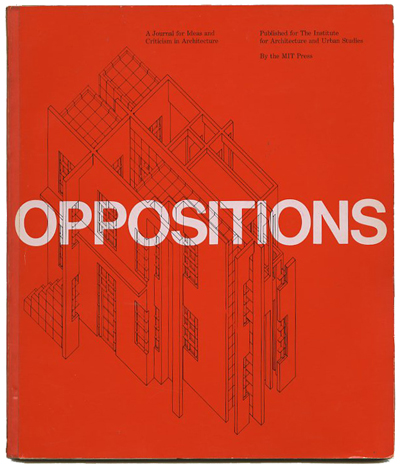
OPPOSITIONS 22
A JOURNAL FOR IDEAS AND CRITICISM IN ARCHITECTURE
Peter Eisenmann, Kurt Forster, Kenneth Frampton, Mario Gandelsonas, Anthony Vidler [Editors]
Peter Eisenmann, Kurt Forster, Kenneth Frampton, Mario Gandelsonas, Anthony Vidler [Editors]: OPPOSITIONS 22: A JOURNAL FOR IDEAS AND CRITICISM IN ARCHITECTURE. Cambridge: MIT Press/The Institute For Architecture And Urban Studies, Fall 1980. First edition. 8vo. Silkscreened perfect bound French-folded wrappers. 122 pp. Black and white photographs and diagrams. Designed by Massimo Vignelli. Cover silkscreened on Champion Colorcast Cover Stock. Interior unmarked and very clean. Orange covers lightly shelfworn with neat tape spine reinforcement, so a very good copy.
8.5 x 9.75 perfect-bound softcover book with 122 pages profusely illustrated with black and white photographs and diagrams. Legendary journal published from 1973 to 1981 that attempted to reconcile the embedded traditions of Modernism with contemporary advances in architecture and urban theory. Highly recommended for both form and content.
- Criticism
- Hiromi Fujii's Vision-Reversing Machine by Hajime Yatsuka
- House/Pharmacy, Chofu, Tokyo by Hiromi Fujii
- Architectural Metamorphology by Hiromi Fujii
- Theory
- Louis Kahn and the French Connection
- History
- The Retrieval of Memory: Alvar Aalto's Typological Conception of Design by Dimitri Porphyrios
- Documents
- The Remoteness of "die Moderne"
- Art, Handicraft, Technology (1922) by Adolf Behne
- Reviews and Forum
Artists, designers, and architects include Hiromi Fujii, Louis Kahn, Alvar Aalto, Eliel Saarinen, Gunnar Asplund, Hermann Muthesius, Peter Behrens, F. H. Ehmcke, C. F. A. Voysey, August Endell, Bernhard Pankok, Henry Van de Velde, Le Corbusier, George Walton, and others.
The Institute For Architecture And Urban Studies was founded in 1967 as a non-profit independent agency concerned with research, education, and development in architecture and urbanism. It began as a core group of young architects seeking alternatives to traditional forms of education and practice. Peter Eisenman was appointed as the Institutes first executive director followed by Anthony Vidler (1982), Mario Gandelsonas (1983) and Stephen Petersen (1984). In 1985 the Institute ceased to exist. ... Like tears in the rain.
Massimo Vignelli (Italy, 1931 – 2014) recalls the exact day that he found the design language that he would be known for. It was 1963, he had a studio in Milan, Lella & Massimo Vignelli Design & Architecture, where he designed in a reductive manner using Helvetica, black rules, and solid colored backgrounds. He put this into practice for Sansoni designing formats for scores of series and hundreds of books until leaving Italy for American in 1965. Today he uses more Bodoni, but hasn’t changed his basic design attitude one iota. He made his early reputation by designing strict formats for series like these.
"I always worked like this from the very beginning, I never had another way but this structural approach," admits Vignelli proudly. "My aim was always to reach maximum impact, so I used Helvetica on white or solid color backgrounds, which stood out — boom — from the texture of all the other books on the shelves. I designed many series this way, I had some books with only white covers with type raining down and some with a black and white illustration on bottom. We wanted to develop standards to avoid gratuitous criticism by publisher’s wives or secretaries and sales people. First and foremost we were searching for objectivity. So we convinced the publisher that a book was like a soap box. The publisher’s brand was the important thing, so each book looked alike. We played safe with the illustration by using things from the past. Who could argue with Rembrandt and Durer?" [oppositions_2019]


 Updating...